
ABOUT the project
LetsGetChecked, are a medical health testing platform that allow their customers to access regulated laboratory testing and self-test from their home.
THE CHALLENGE
Business Goals:
• Improve conversions on the Sexual Health landing page.
• Increase the amount of sessions per user.
Project Goals:
• Customers will have a more enjoyable experience when making a purchase.
• Customers will be able to interact with the products and learn how they work.
THE SOLUTION
After studying the websites analytics and interviewing users I found that the prominent reason for the lack of conversions, was down to the lengthy purchasing process. Additionally they felt there was two much content in terms of how the product worked and asked if this could be simplified.
MY ROLE
• User Interviews
• Analytical Research
• Concept / Usability Testing
• Personas / Journey Map
• Wireframes
• Prototypes Low to High
• Iterating Concepts
• UI Design
• Presentation to Client

As no two projects are the same, my design process varies for each project I work on. This process is determined by many factors such as the project goals, business needs, problem to be solved, time frame etc. Here I’ll describe my process in this project.
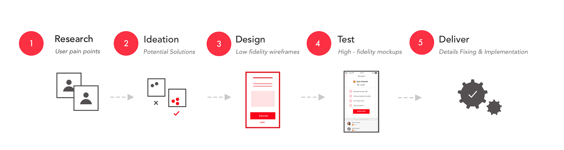

RESEARCH
As I had an existing product to work from I was able to learn a lot about why the page was losing conversions by looking at the website's analytics. Understanding why customers where going to the site was the first step to improving their experience when they got there.
FINDINGS:
• Users found the purchasing process took too long.
• Users didn't like being navigated away from the product page when adding an item to their cart.
• Too much content, users found the duplication of pricing tables, repetitive and unnecessary.
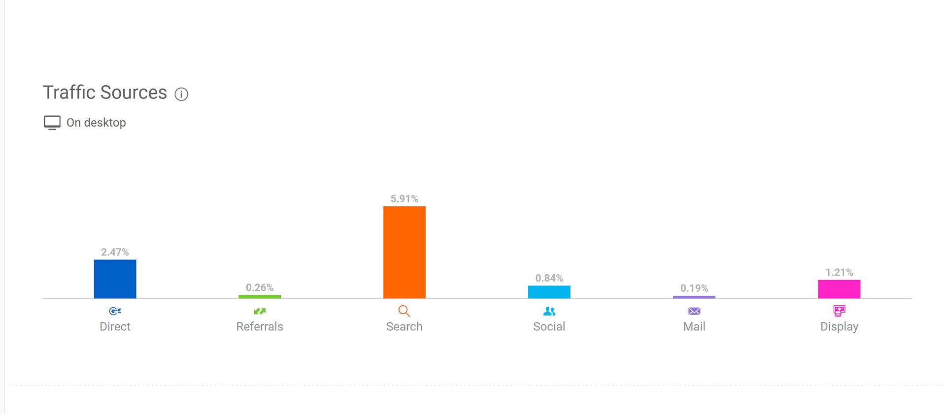
Traffic Sources
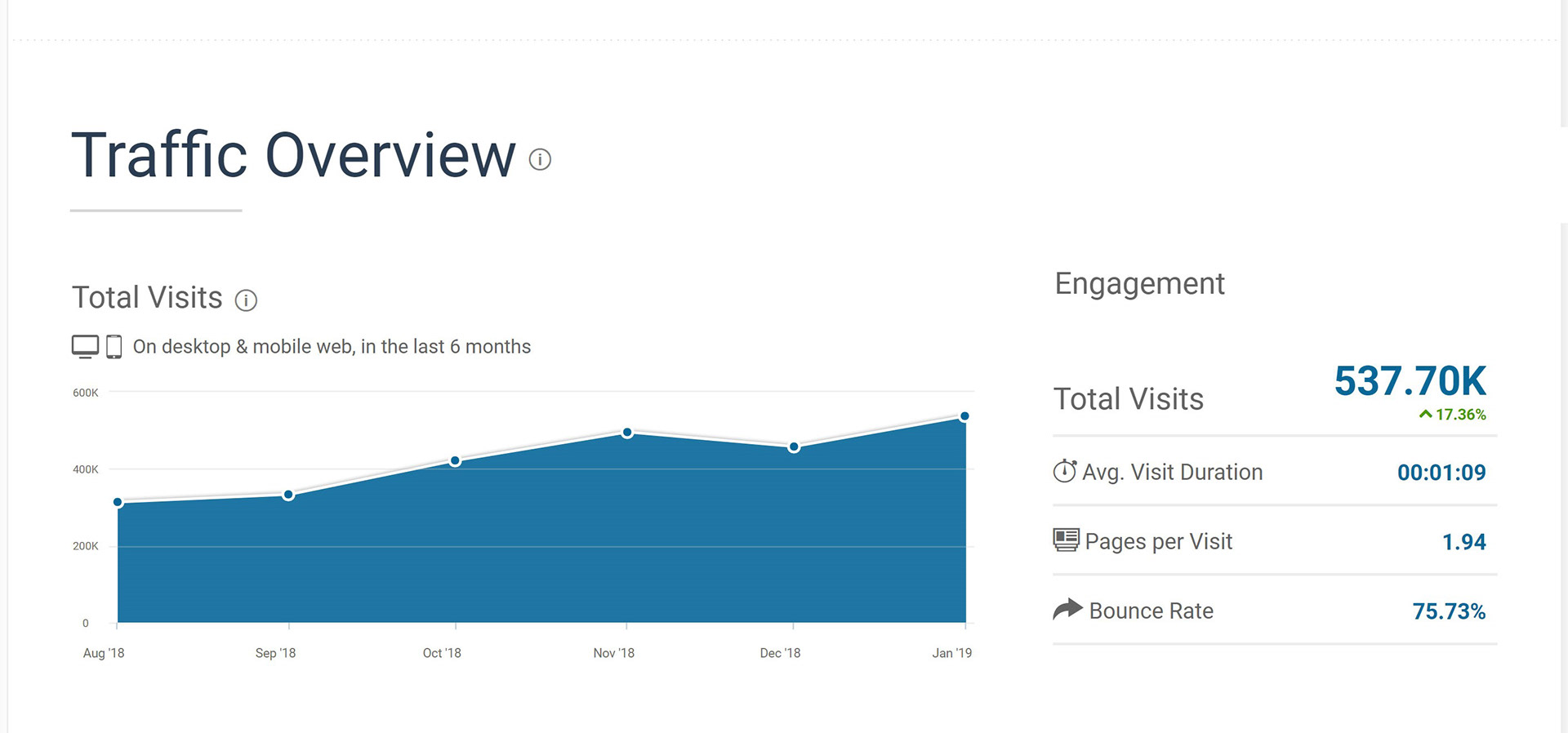
Traffic Overview
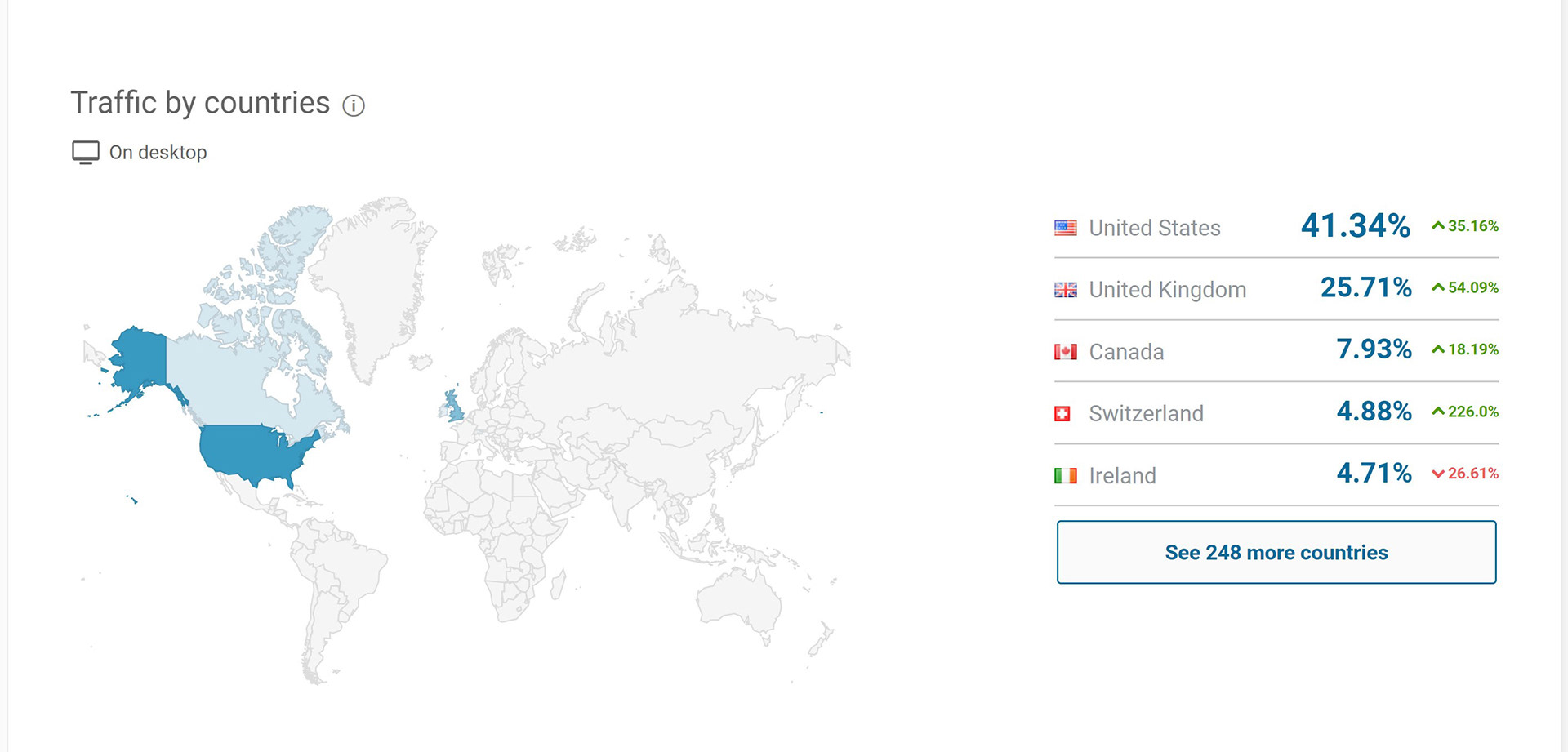
Traffic by country
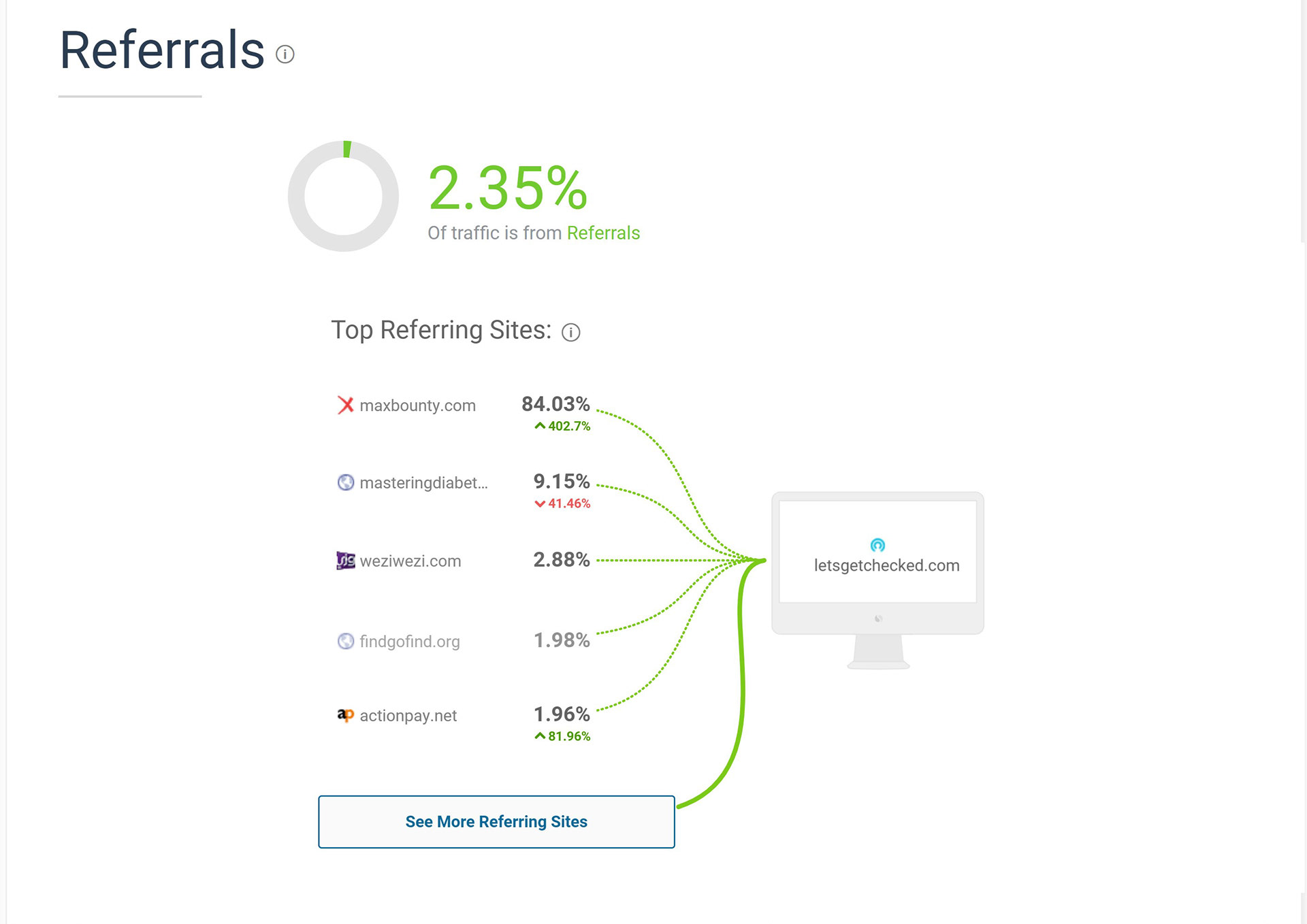
Referrals
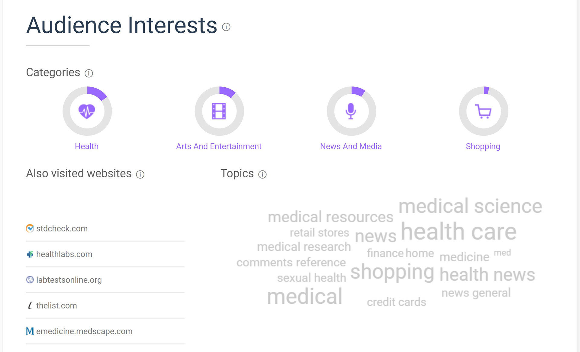
Audience Interests
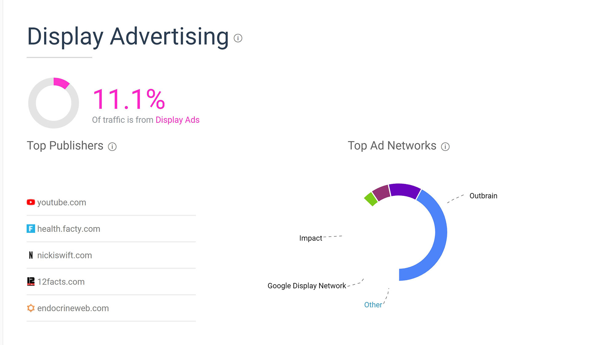
Display Advertising
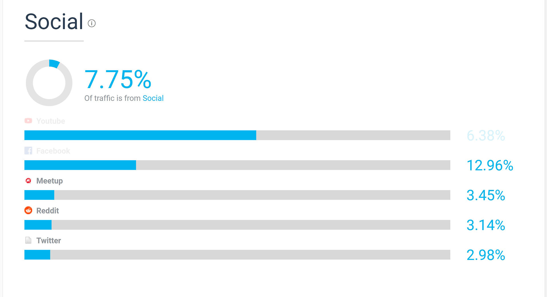
Social platforms
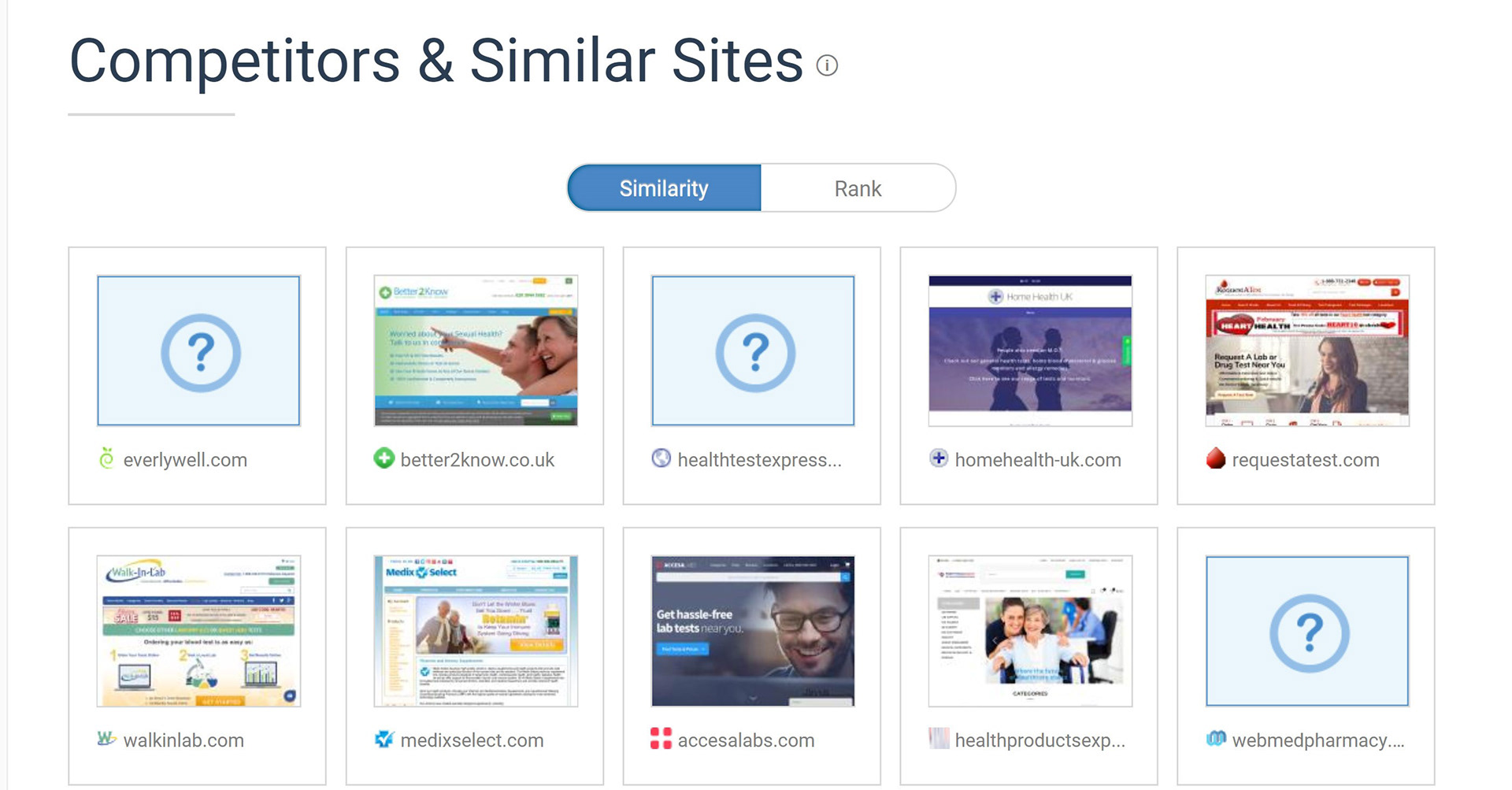
Competitors
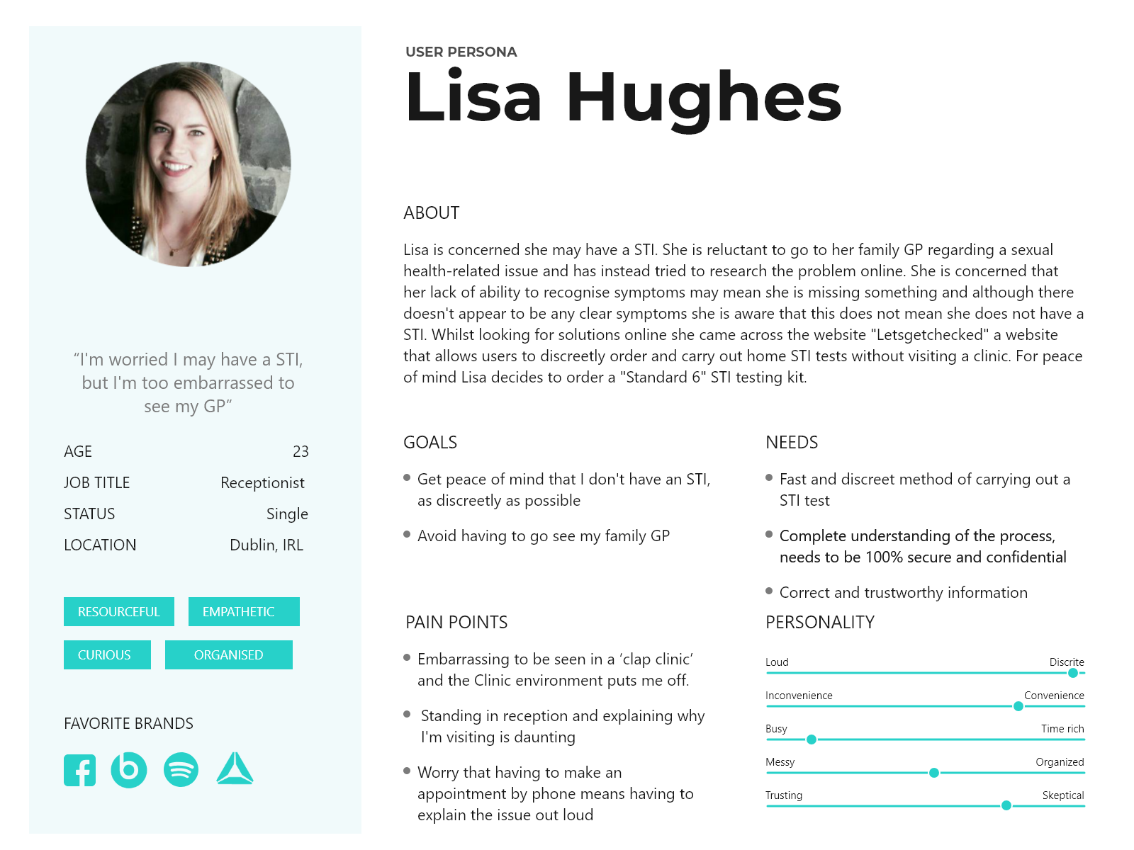
PERSONAS
Moving on from analytical research I was able to gain great insight by carrying out usability tests accompanied with brief interviews with users. Based on this research I set up personas. The personas detailed user background, motivations and other useful data. On analysis of the data, certain behavior patterns and demographics started to emerge.
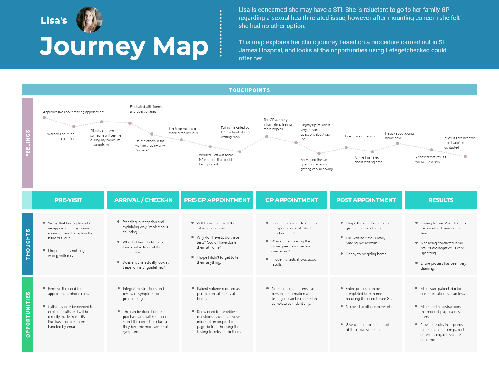
JOURNEY MAP
The persona was used to create a journey map. This map focused on user goals and frustrations with their current process and looked at potential opportunities. This process helped me identify why users were attracted to the website in the first place and how I could help them get what they wanted from the website, thereby improving conversions:
• Integrate instructions and review of symptoms on product page.
• Minimize distractions on product page.
• Simplify product information.

IDEATING SOLUTIONS
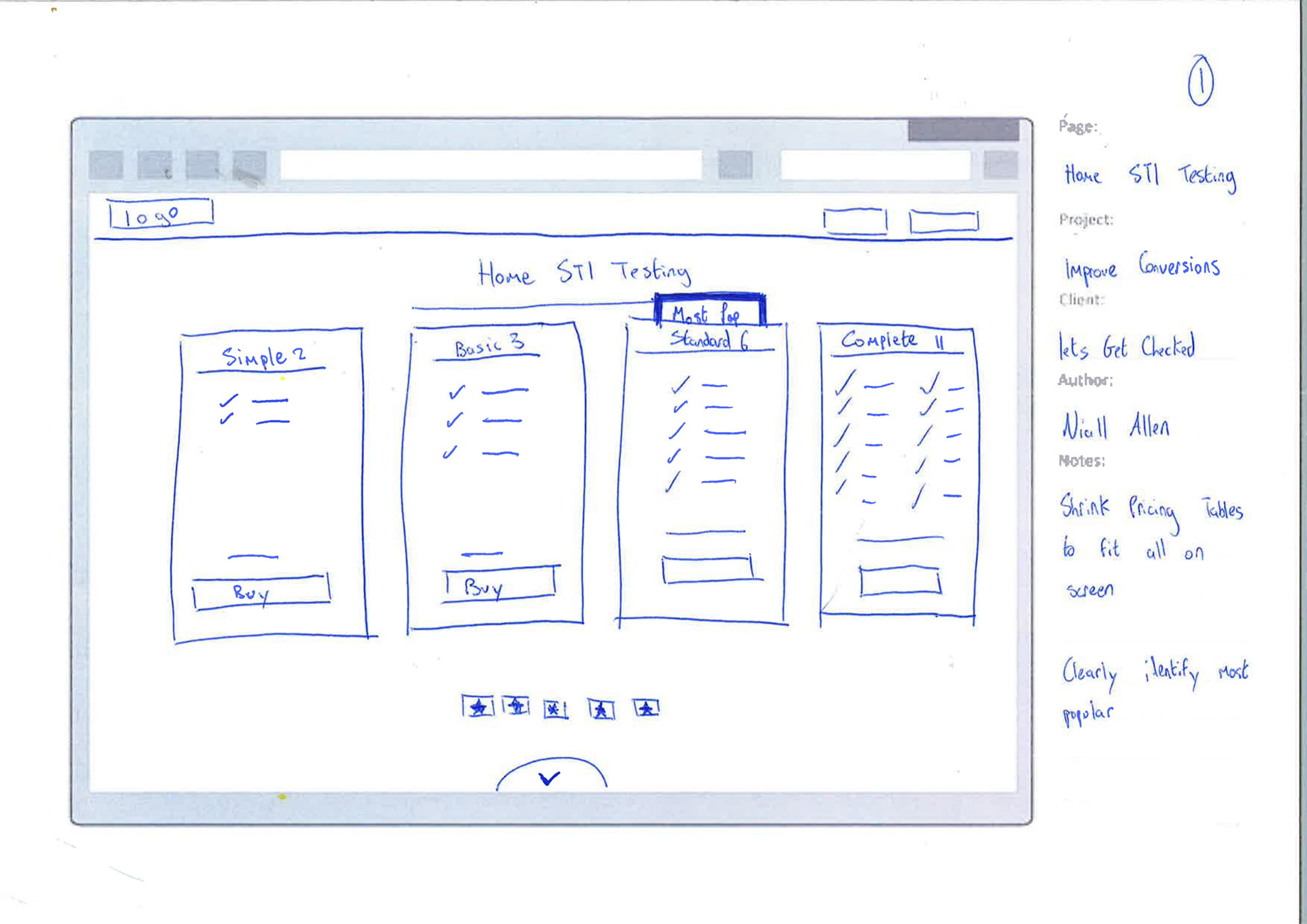
LOW FIDELITY WIREFRAMES:
This project had a tight deadline of 3 days, as a result I had to sketch each iteration quickly and add the elements and screens only necessary to reach users' goals, to quickly see which ideas worked best.
FINDINGS:
• Users found the purchasing process much faster.
• Users liked that the "How it works" section was more condensed.
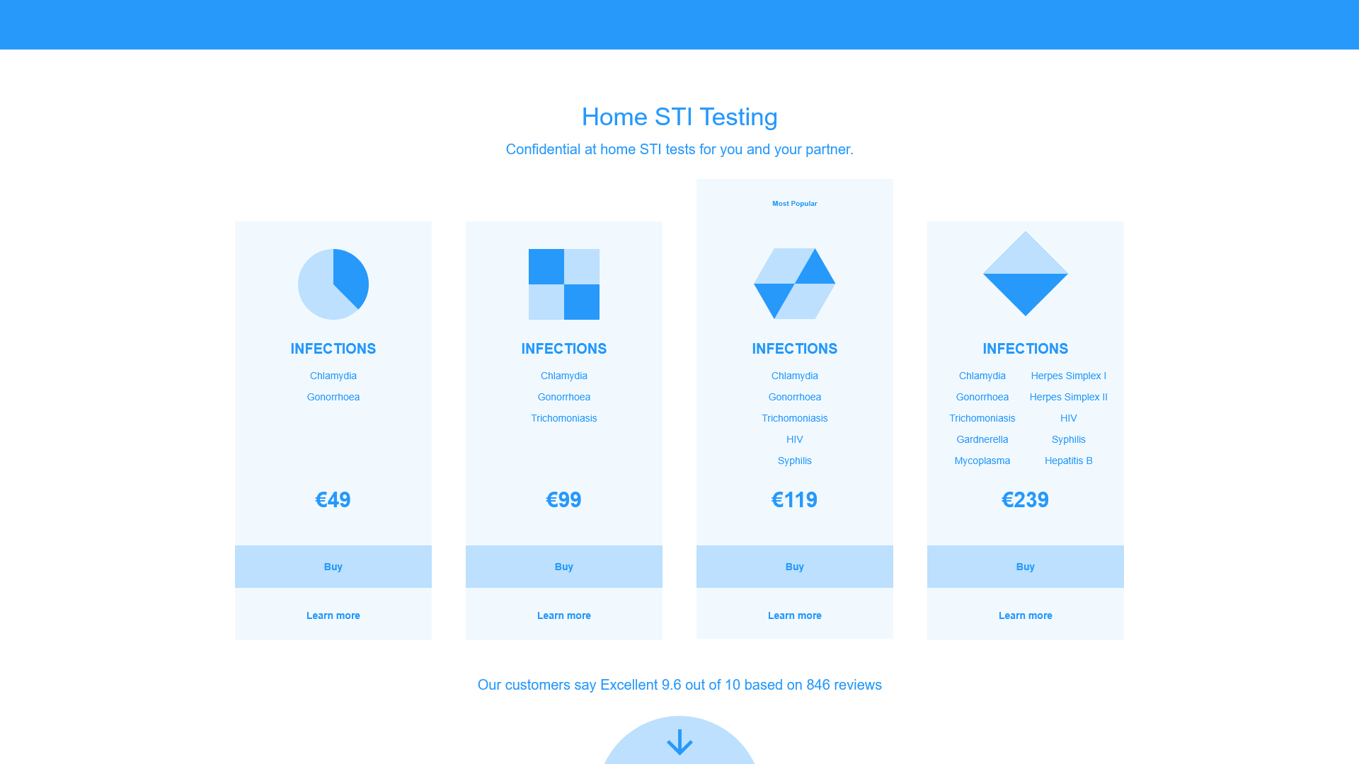
DESIGN SOLUTIONS:
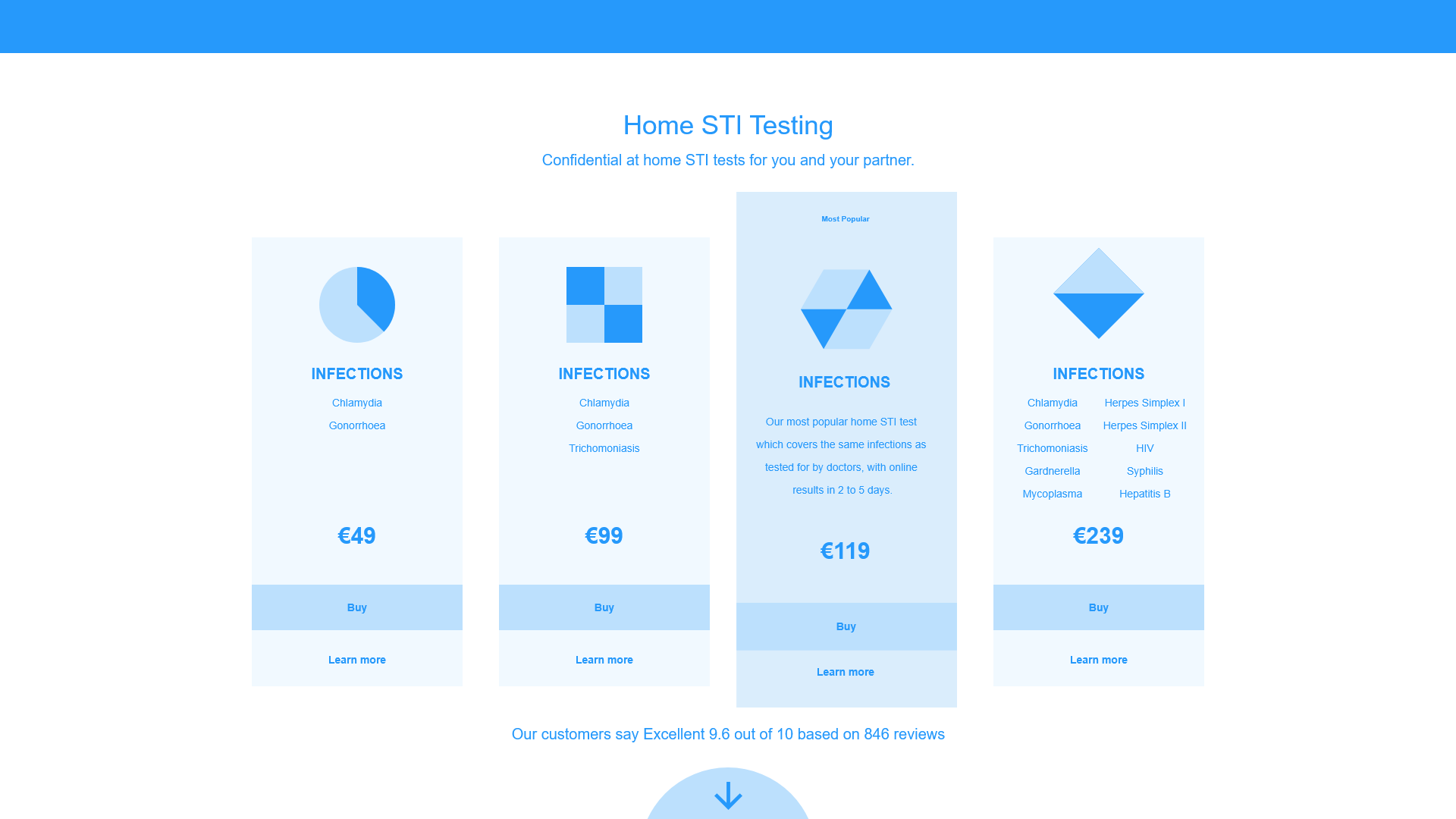
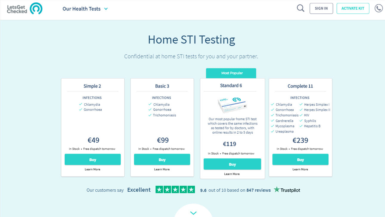
• Product information to display on hover of product card.
• Product purchasing to be displayed on the same page as products.
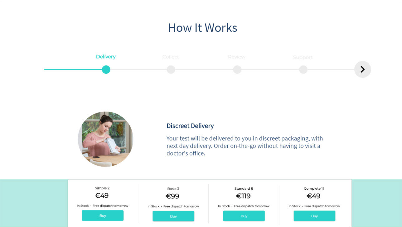
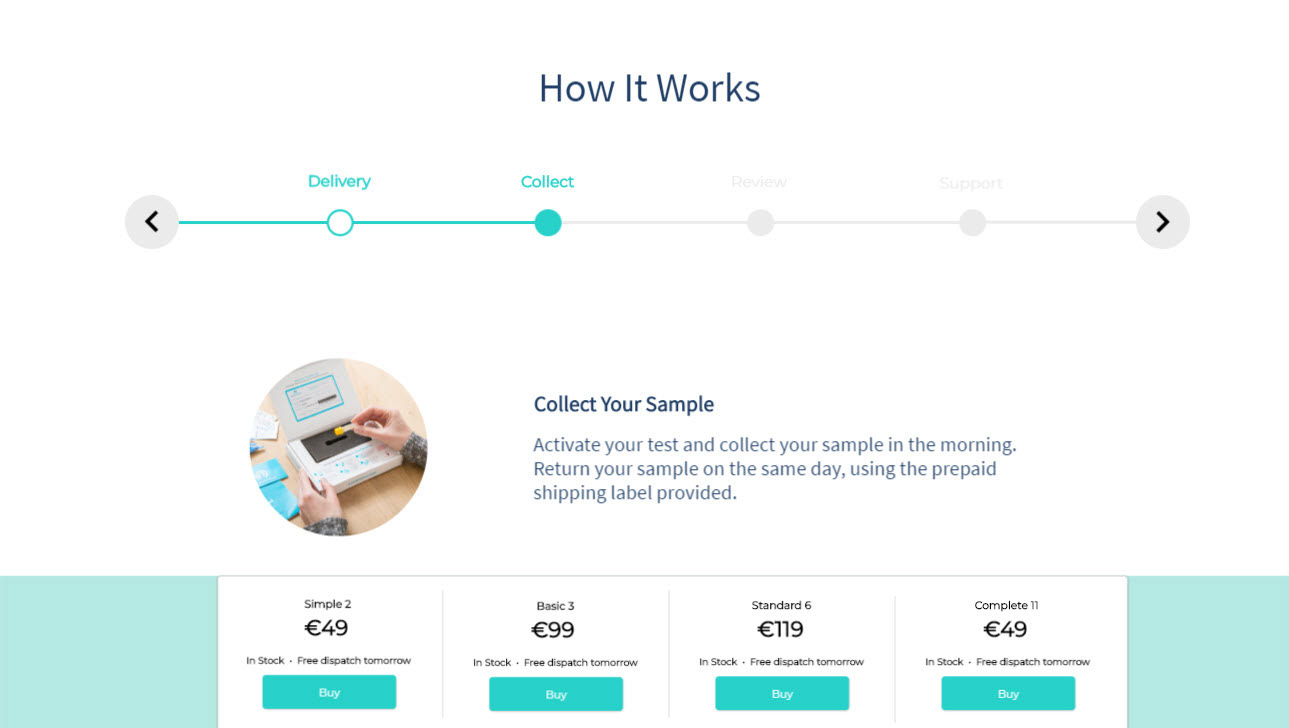
• Allow user to navigate through "How it work's" section.
Home
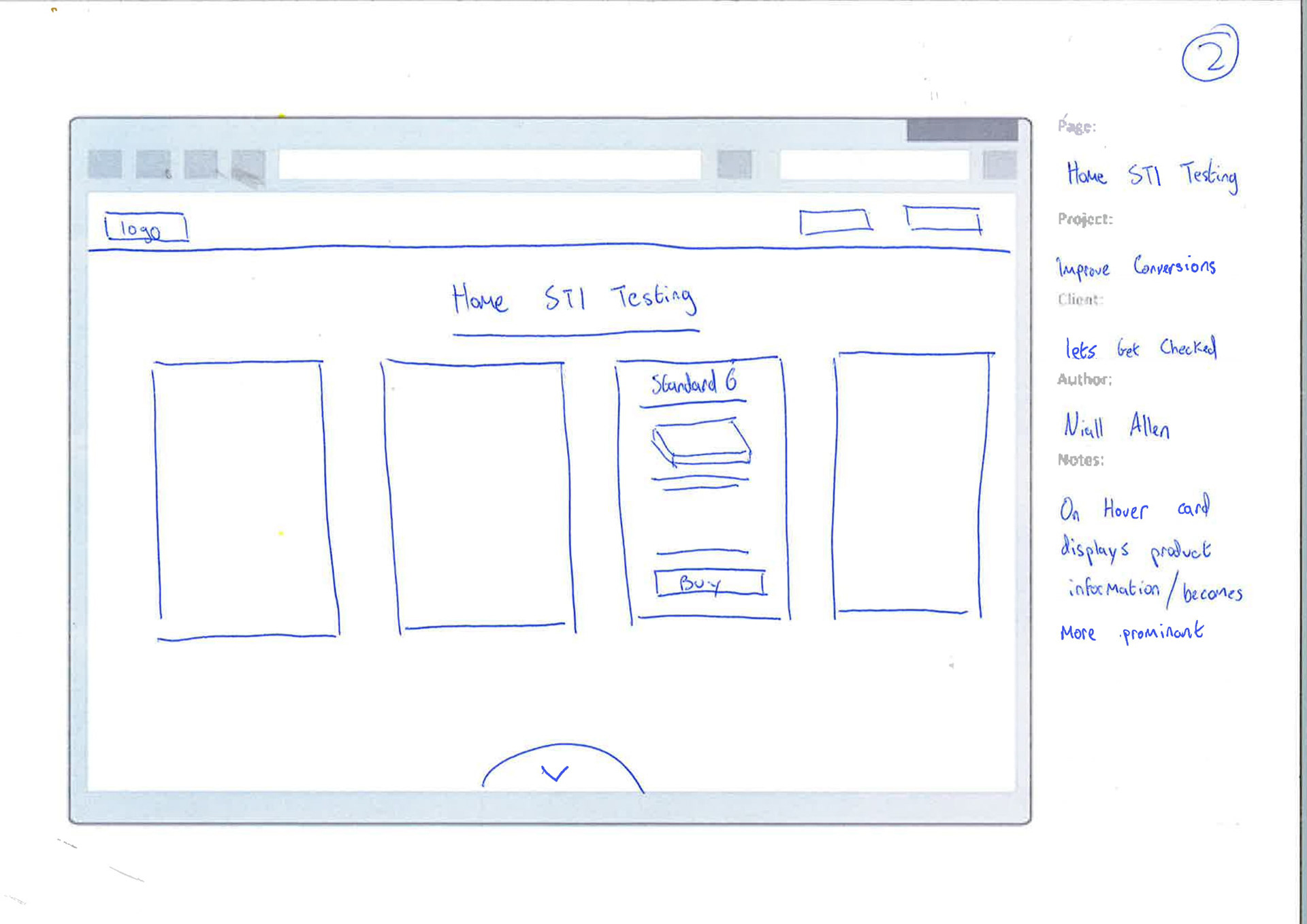
On Hover
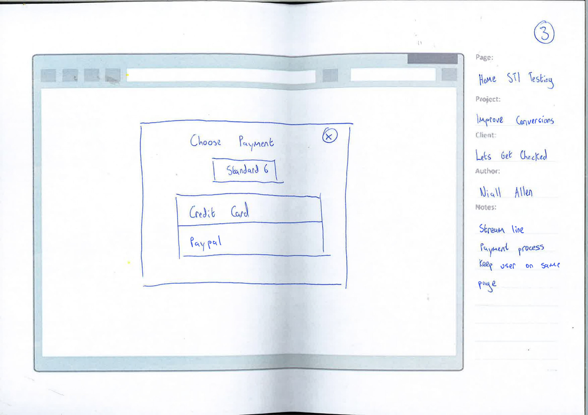
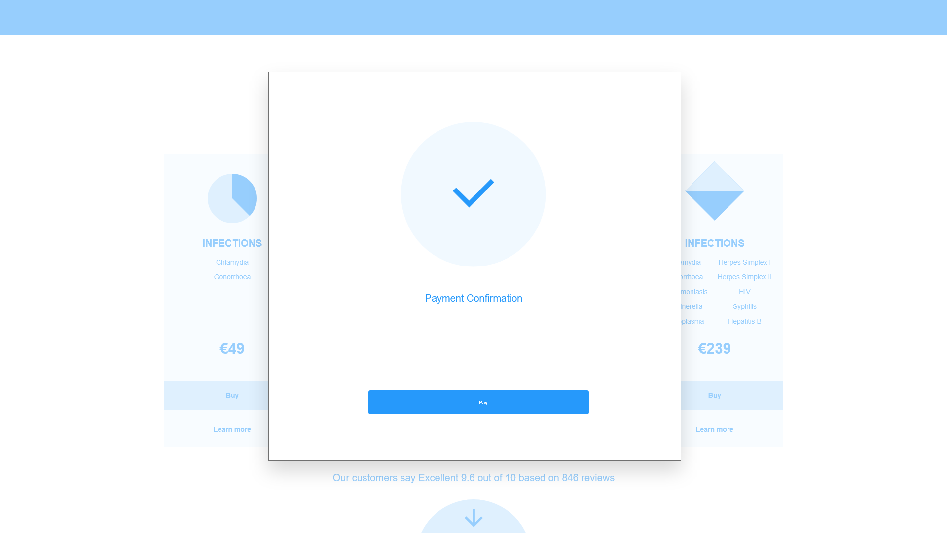
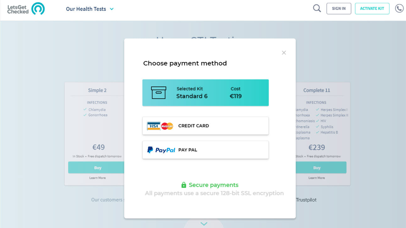
Payment Selection
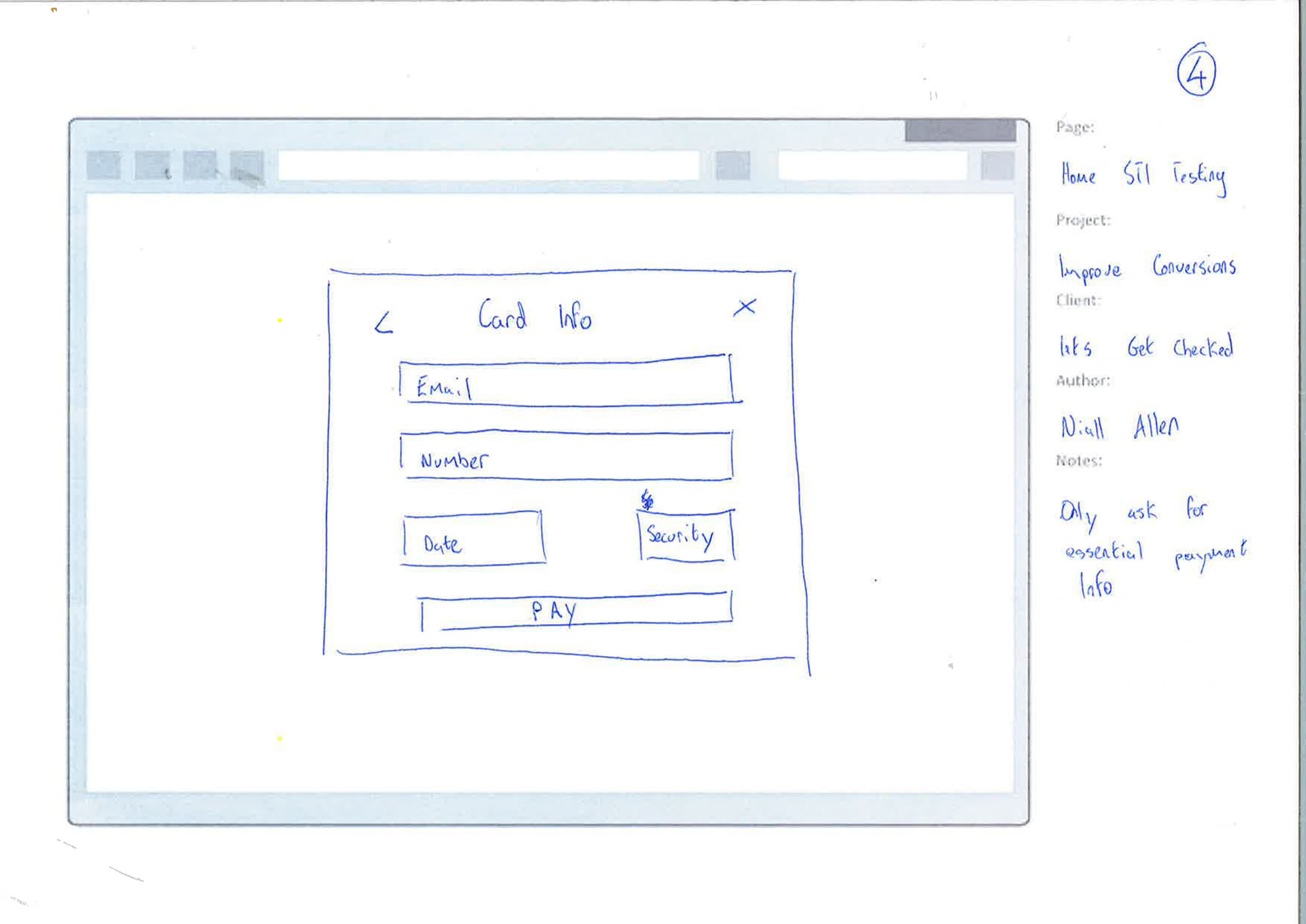
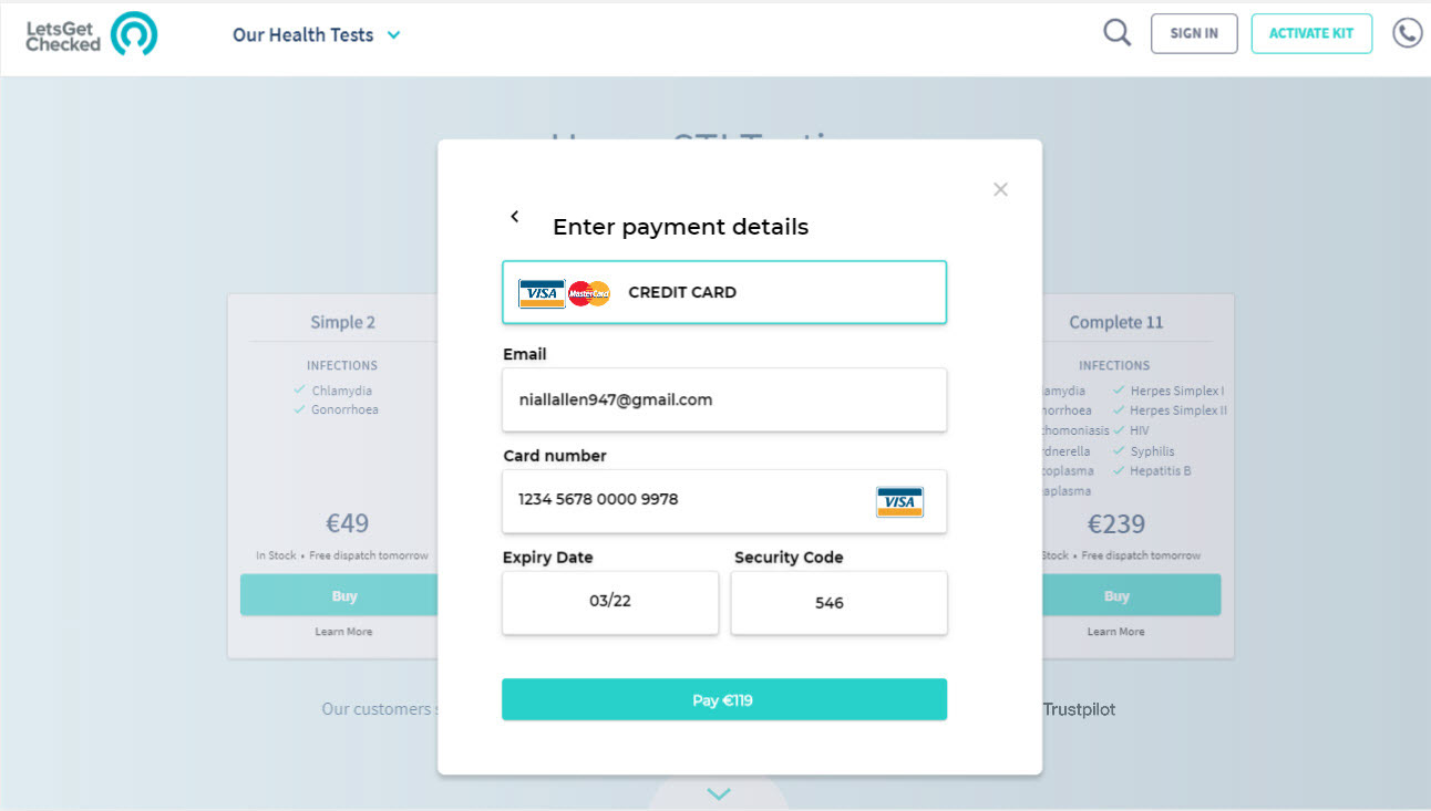
Card Details
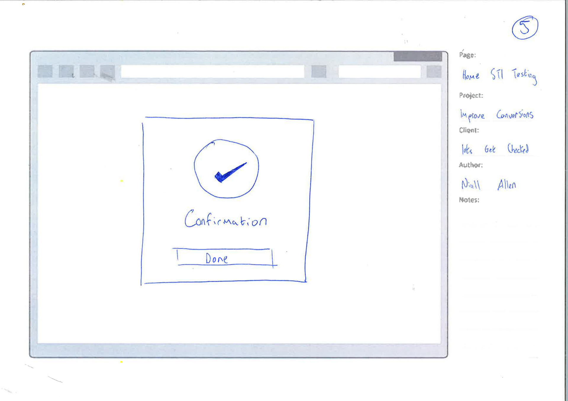
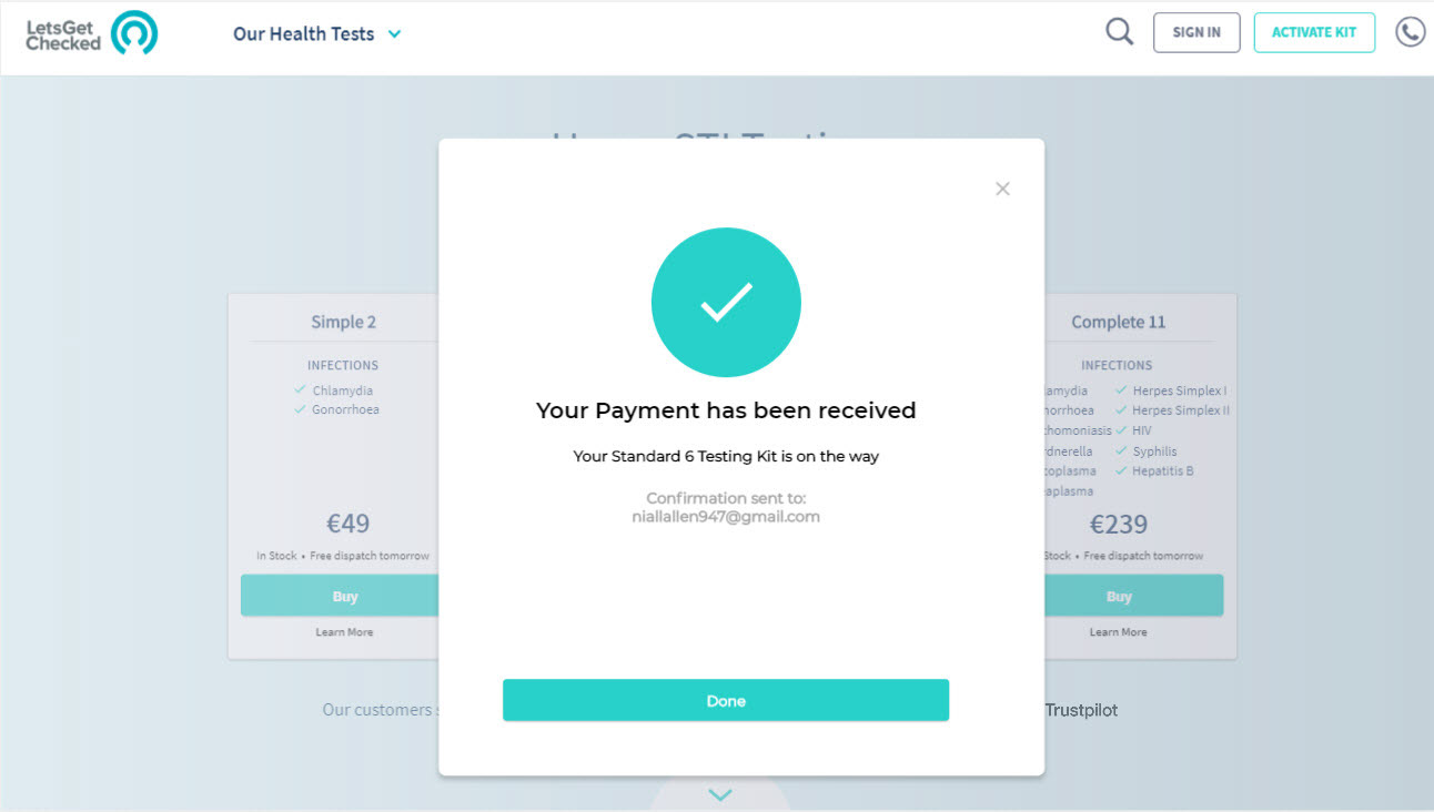
Payment Confirmation
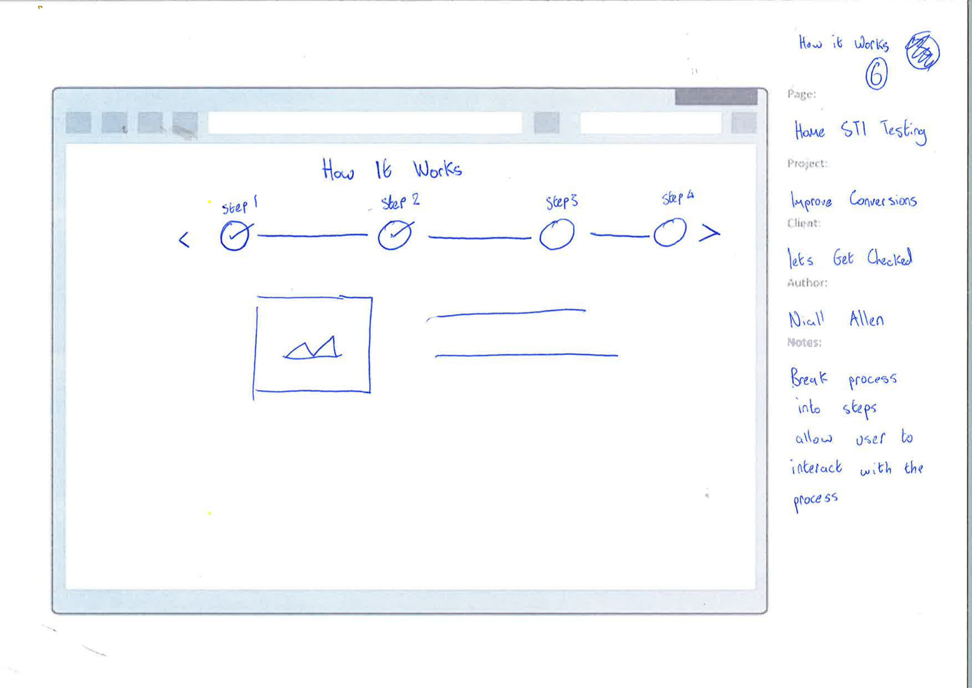
How it works
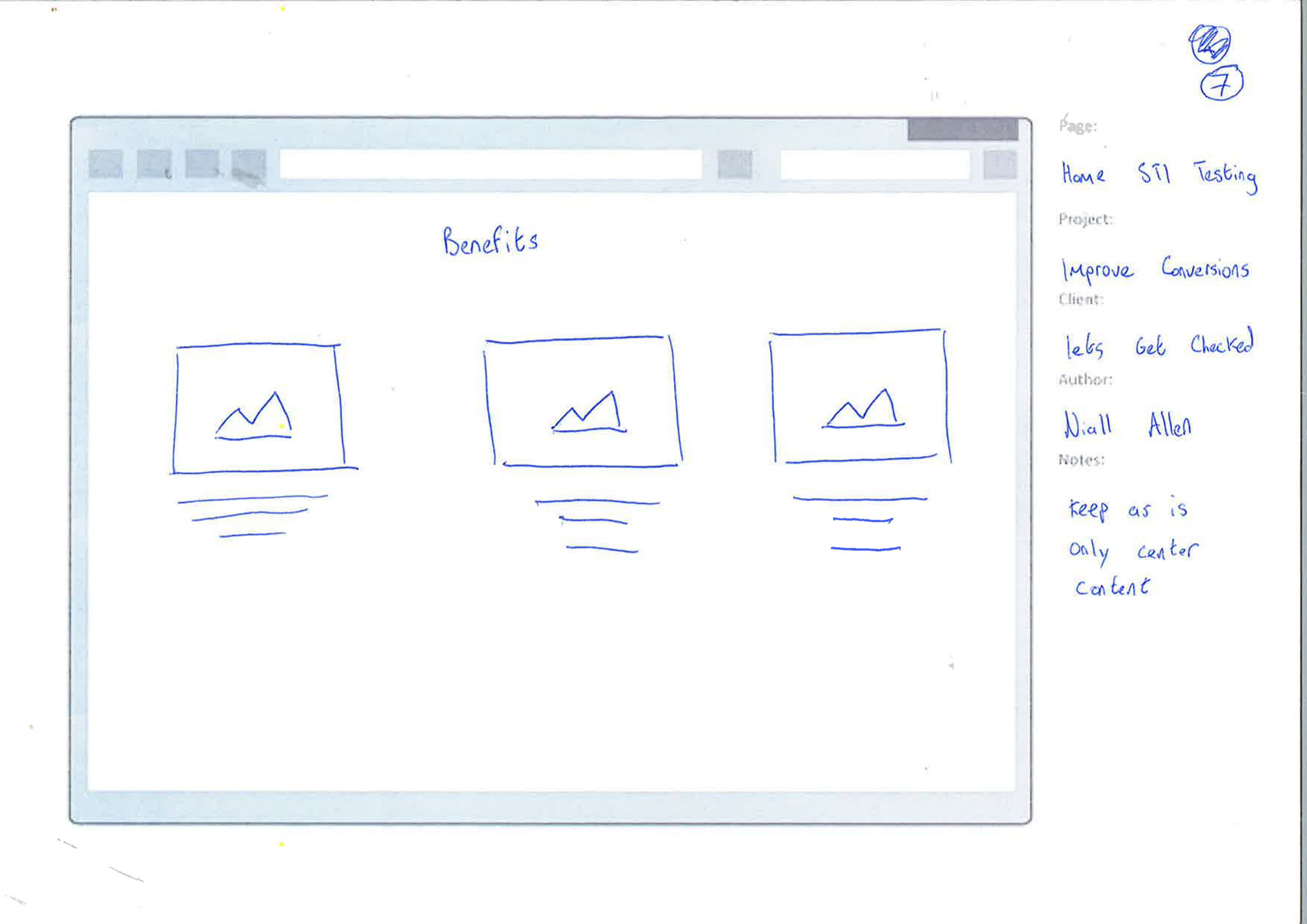
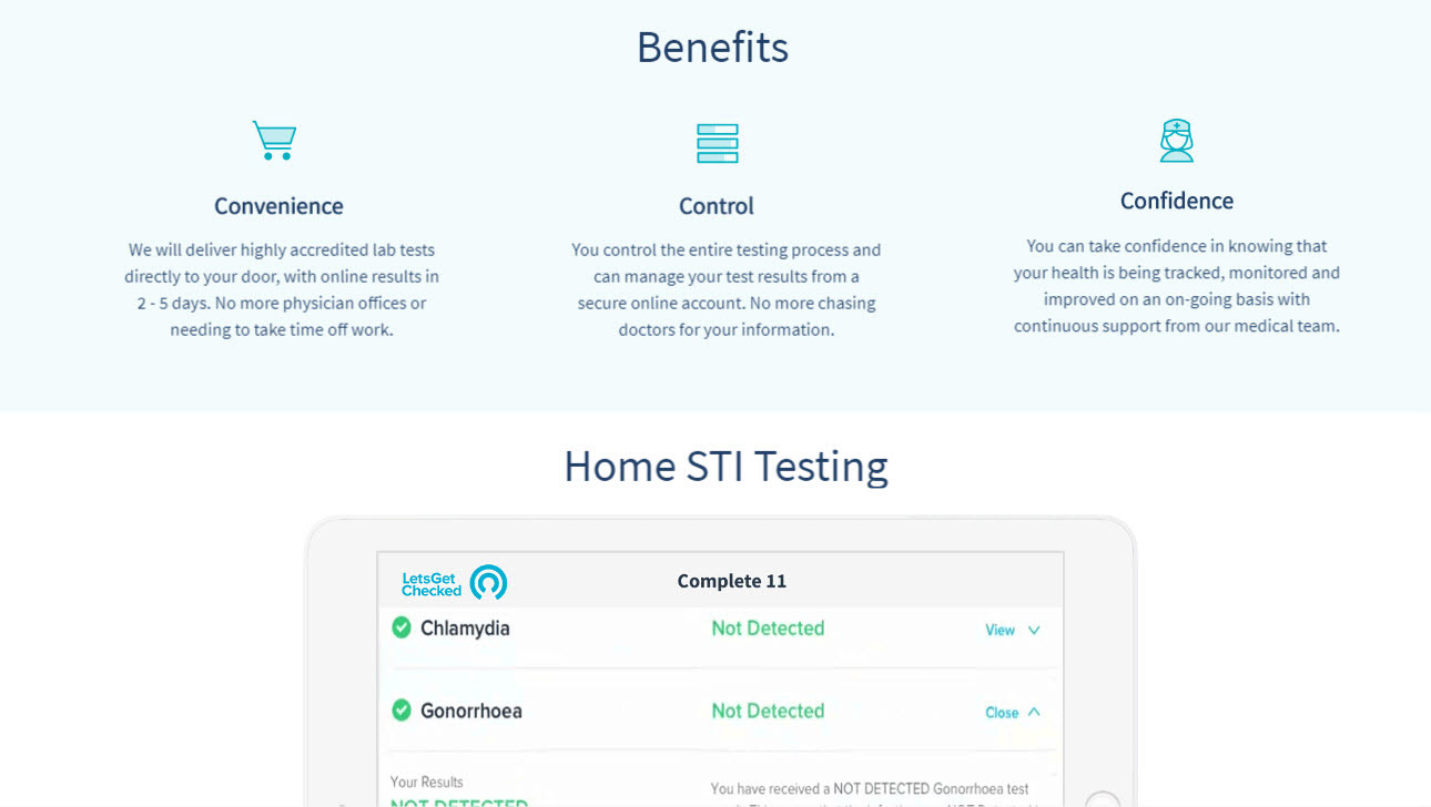
Benefits
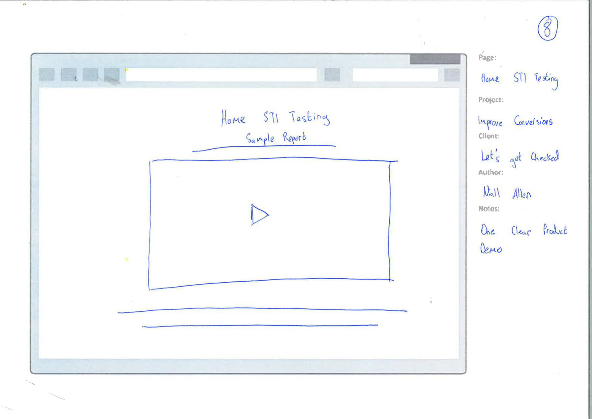
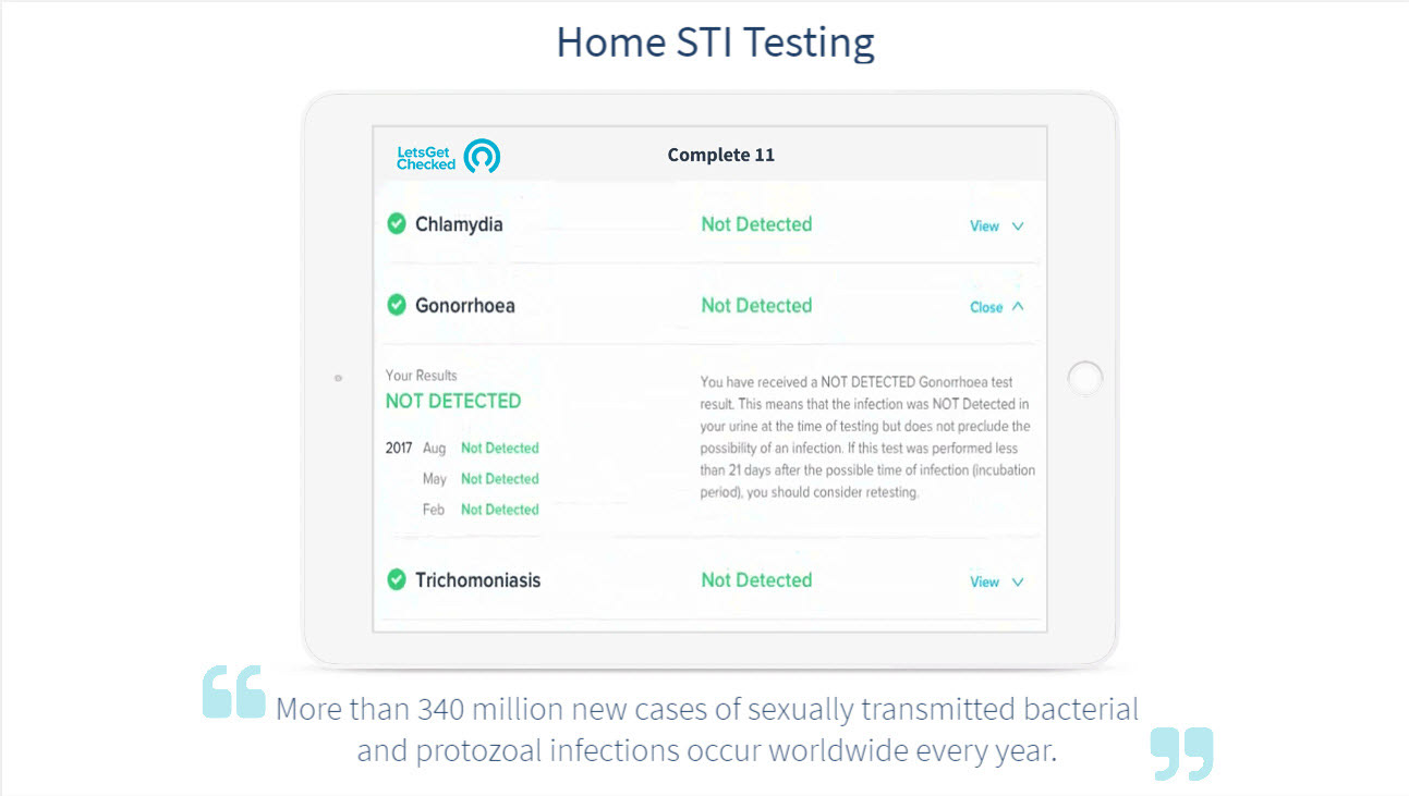
Demo
Info Slider
PROTOTYPING
MID FIDELITY WIREFRAMES:
I turned my revised sketches into a more polished interactive prototype done with XD. This prototype highly emphasised a streamlined purchasing process and was tested in-person and remotely with users.
FINDINGS:
• Users liked that the new interactive "How it works" section.
• Users liked that they could easily view product information and add a product without leaving the product page.
• Users approved of the reduced content on the page but found it a pain to have to navigate back to the top of the page in order to make a purchase.
DESIGN SOLUTIONS:
• When the user scrolls down the page a product footer will appear allowing users to purchase products from all points of the website.
Landing
On Hover
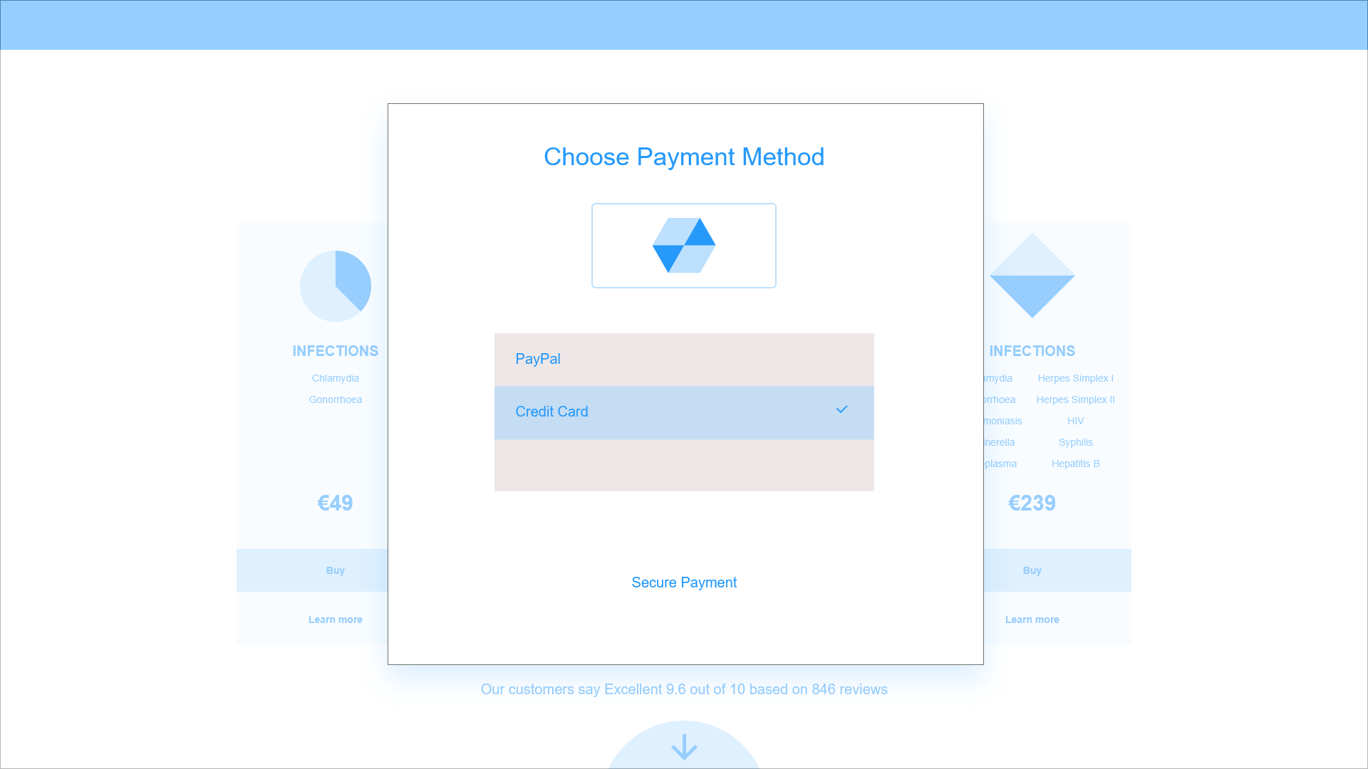
Payment Method
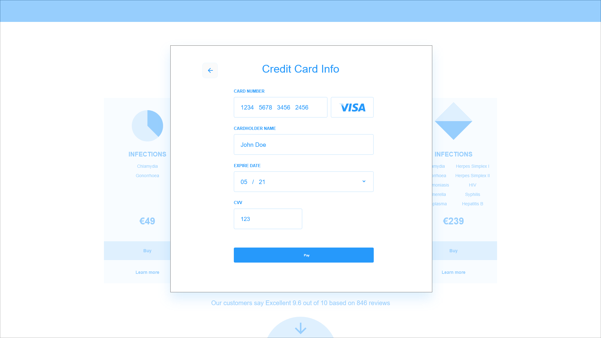
Card Details
Payment Confirmation
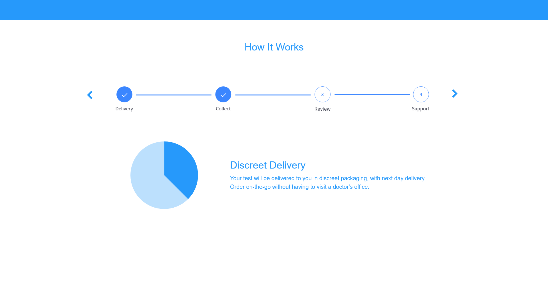
How It Works
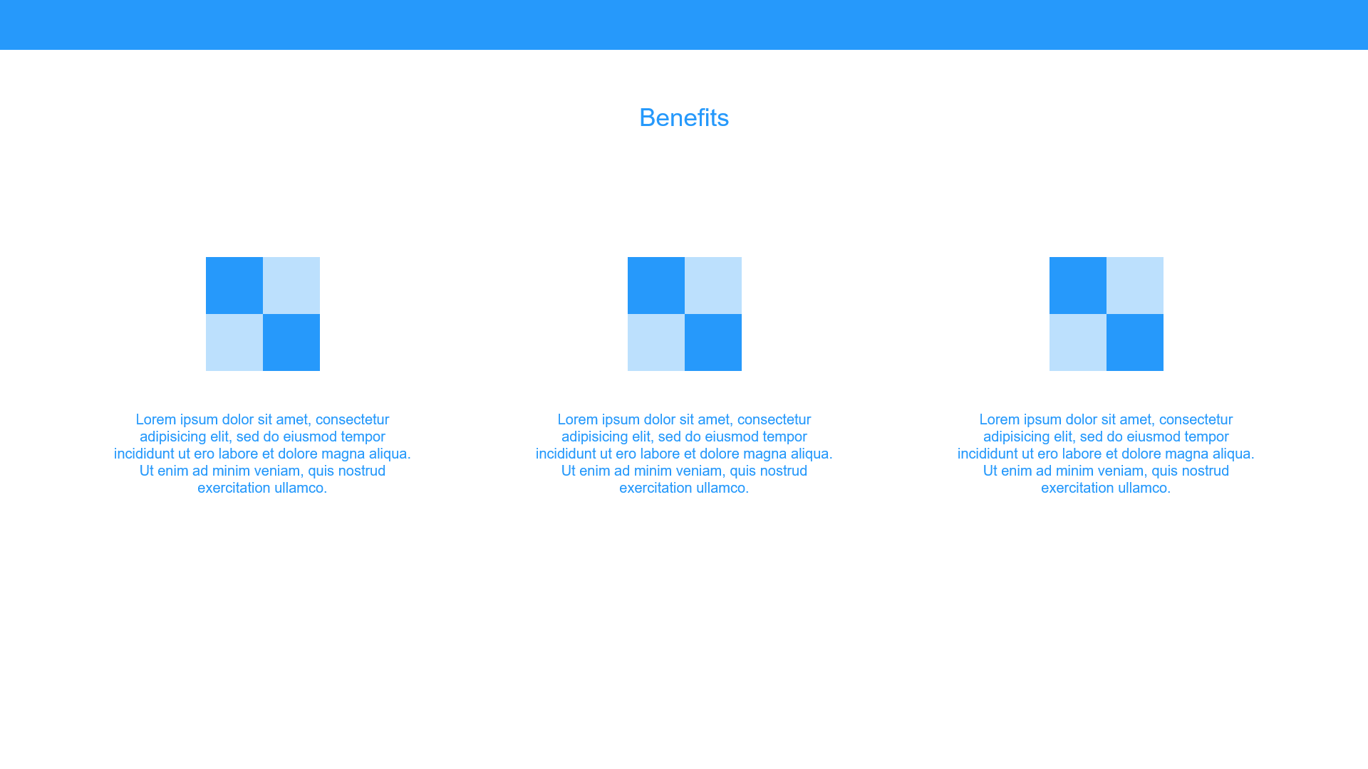
Benefits
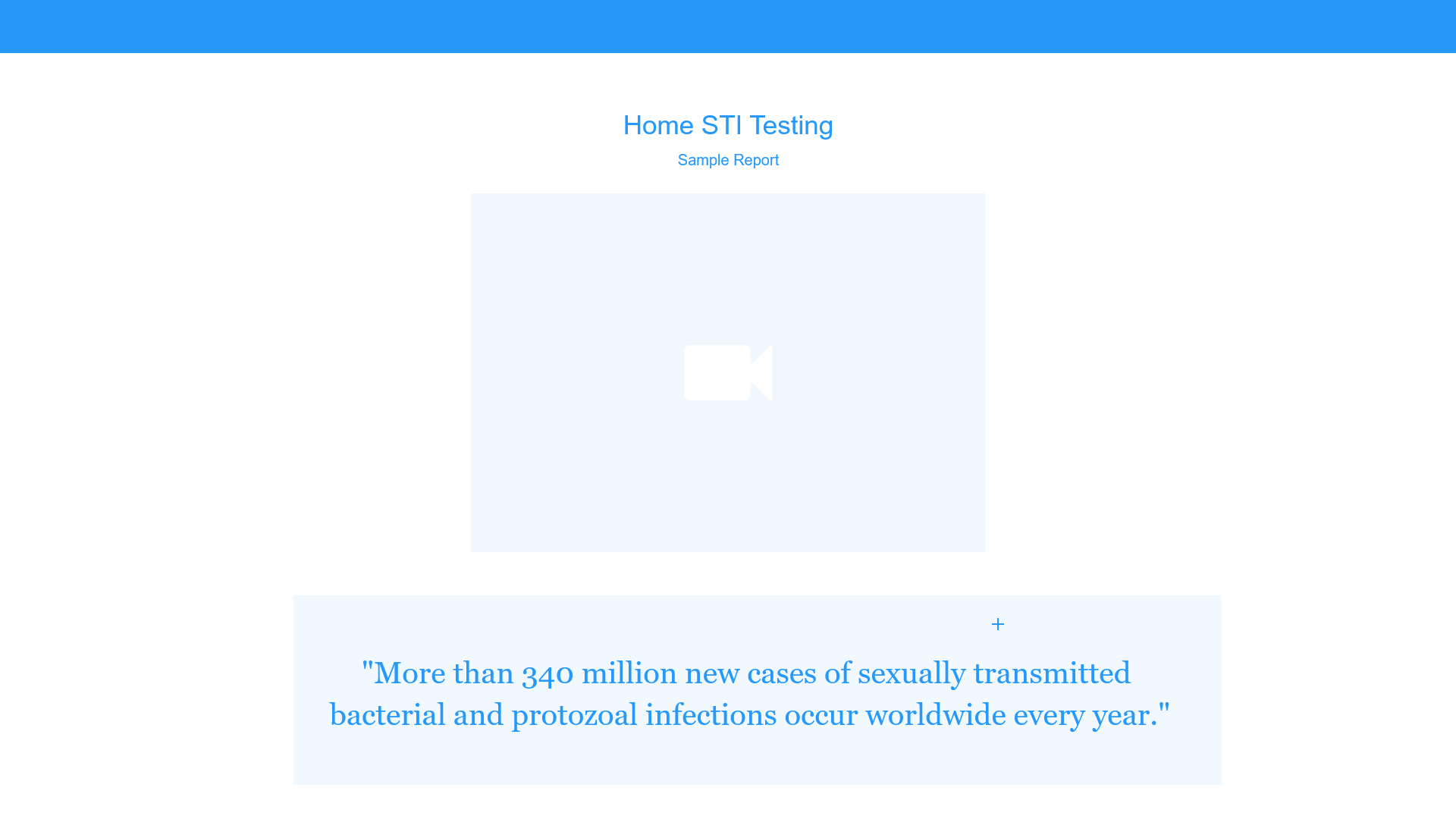
Product Demo
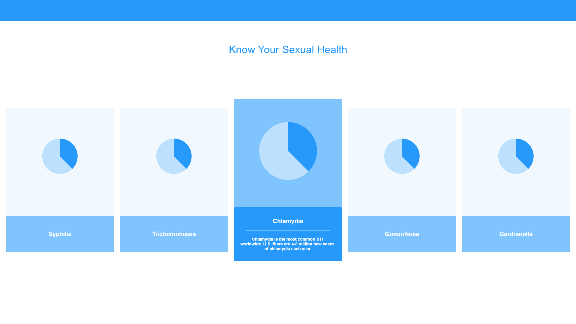
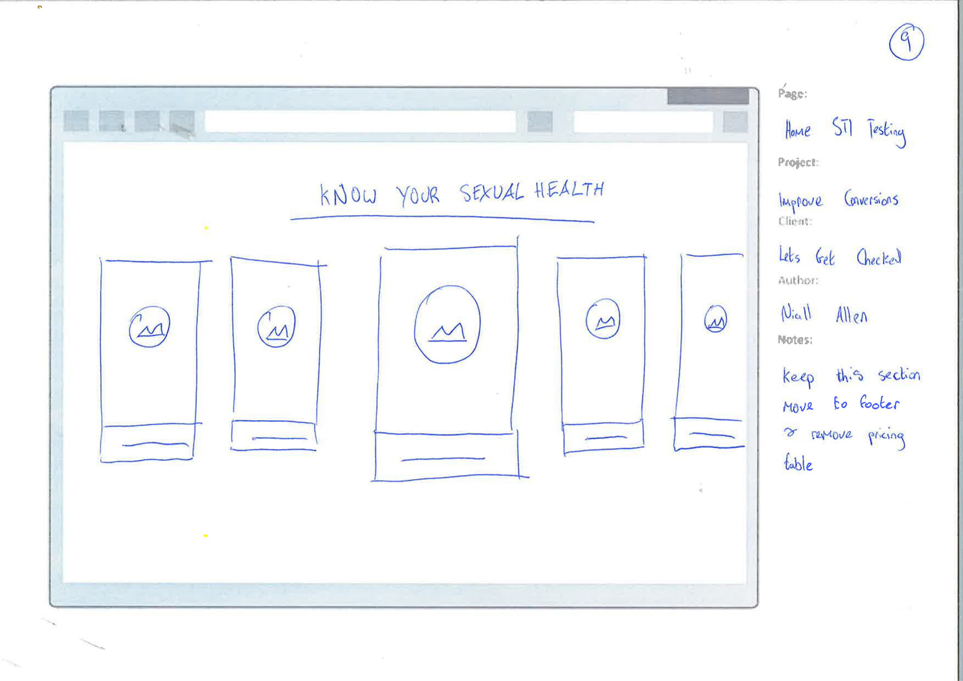
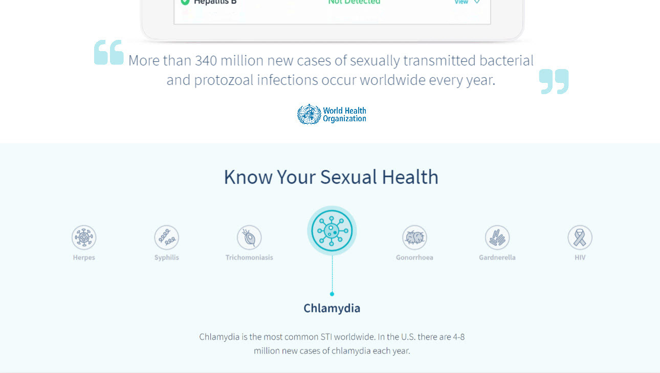
Know your sexual health

FINAL DESIGN
My aim was to create a clean, modern look inline with the existing company brand that helped users fulfill their goals quickly.
UPDATED PRODUCT PAGE
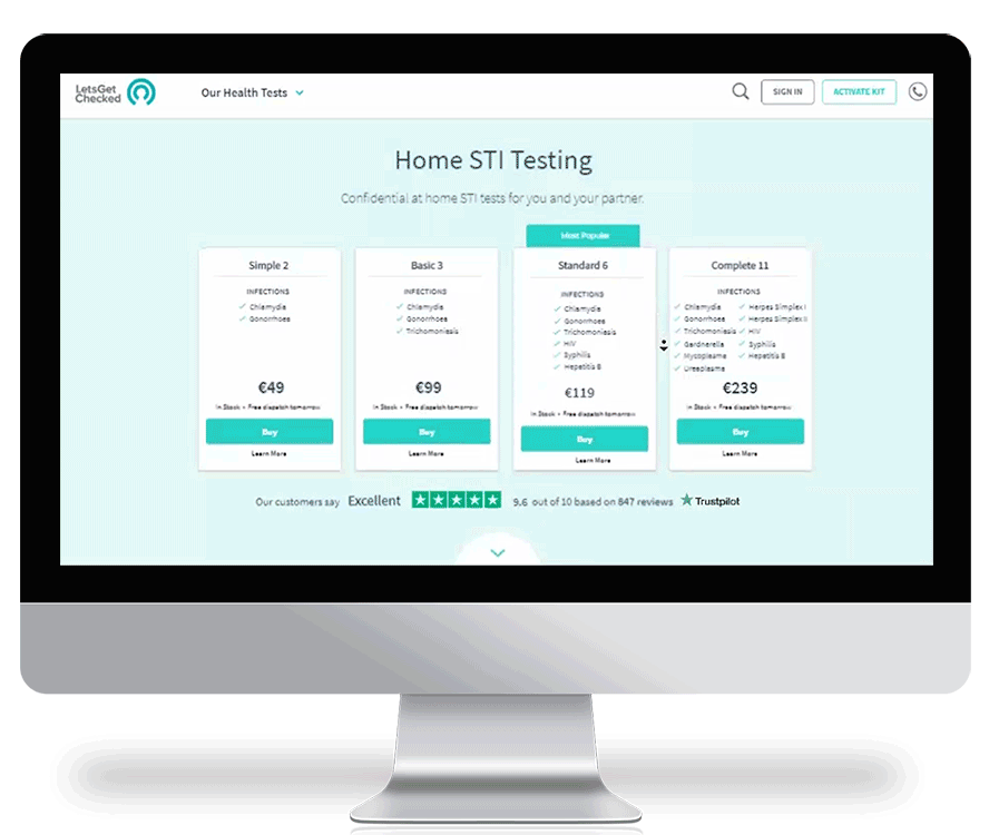
IMPROVED BUYING PROCESS AND INTERACTIVE PRODUCT INFORMATION
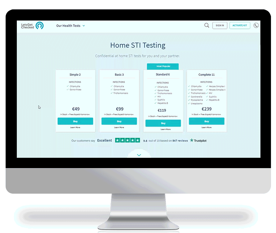
HIGH FIDELITY SCREENS

WHAT I LEARNED
• Pay attention to details: – Forming a personality for the product was not only fun, but it helped me really understand and engage with users.
• Define success metrics: – Defining proper measurements for success is the best way to validate usability. Monitoring the accuracy and completeness with which users where able to achieve specified goals