ABOUT THE PROJECT
UGO IGO is a social/fitness app that's aim is to help people extend their social circles while creating a routine for a healthier lifestyle. UGO IGO will allow users to match with other users with similar fitness interests and communicate via a messaging system.
CHALLENGE
Throughout various discussions with people living in Dublin, (in particular foreign nationals), the general consensus was that socialising in Dublin is quite difficult and finding someone to enjoy an interest or engage in exercise with is even more difficult especially for a non-Dublin native.
THE SOLUTION
To create a digital space where people who share similar interests and locations can be connected, and provide them with an online platform where they can organise events, and enjoy these hobbies together at a time that suits them both. Unlike various dating applications, the team decided to match users by their interests, therefore facilitating meaningful, goal-orientated connections, moving away from the appearance driven trend seen in competitor applications.
MY ROLE
As the UX Designer for the UGO IGO app, I took part in all phases of the project, from mapping out the problem to delivering final designs.
• Product Strategy
• User Research & Analysis
• Persona / Journey Mapping
• MVP Definition
• Wireframes
• UI Design & Prototyping
• Illustration/Icon Design
• Usability Testing
• Branding / Social Media Marketing
• Assisting on Front End
DISCOVER. DEFINE. DEVELOP. DELIVER
PERSONAS
Based on user research I set up personas. The personas detailed user background, motivations and other useful data. On analysis of the data, certain behavior patterns and demographics started to emerge. These patterns were then used to define the core types of users who would make up UGO IGO’s user base.
JOURNEY MAPPING
The information about each persona was used to create journey maps. These maps focused on user goals and frustrations with their current process and looked at potential opportunities. This process helped us identify how our users would get what they wanted from the app:
• Search for other users with similar interests.
• Match and Message like minded user.
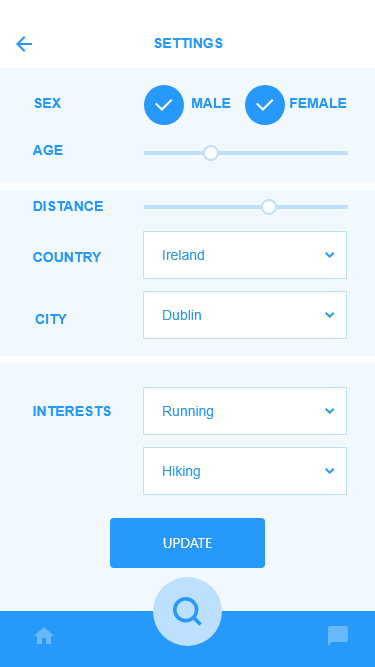
• Ability to filter based on interest, age, sex and location.
• Form Groups with other matched users.
USER FLOW
I created a user flow diagram to map the user interaction required to achieve the main goal of this app: "As a user, I want to match and message another user”
IDEATING SOLUTIONS
BRAINSTORMING
Once the team agreed on the initial core functionalities to be included in the application, we sat down to discuss the design requirements for UGO IGO and how they may best represent the functionality of the app.
LOW-FIDELITY WIREFRAMES:
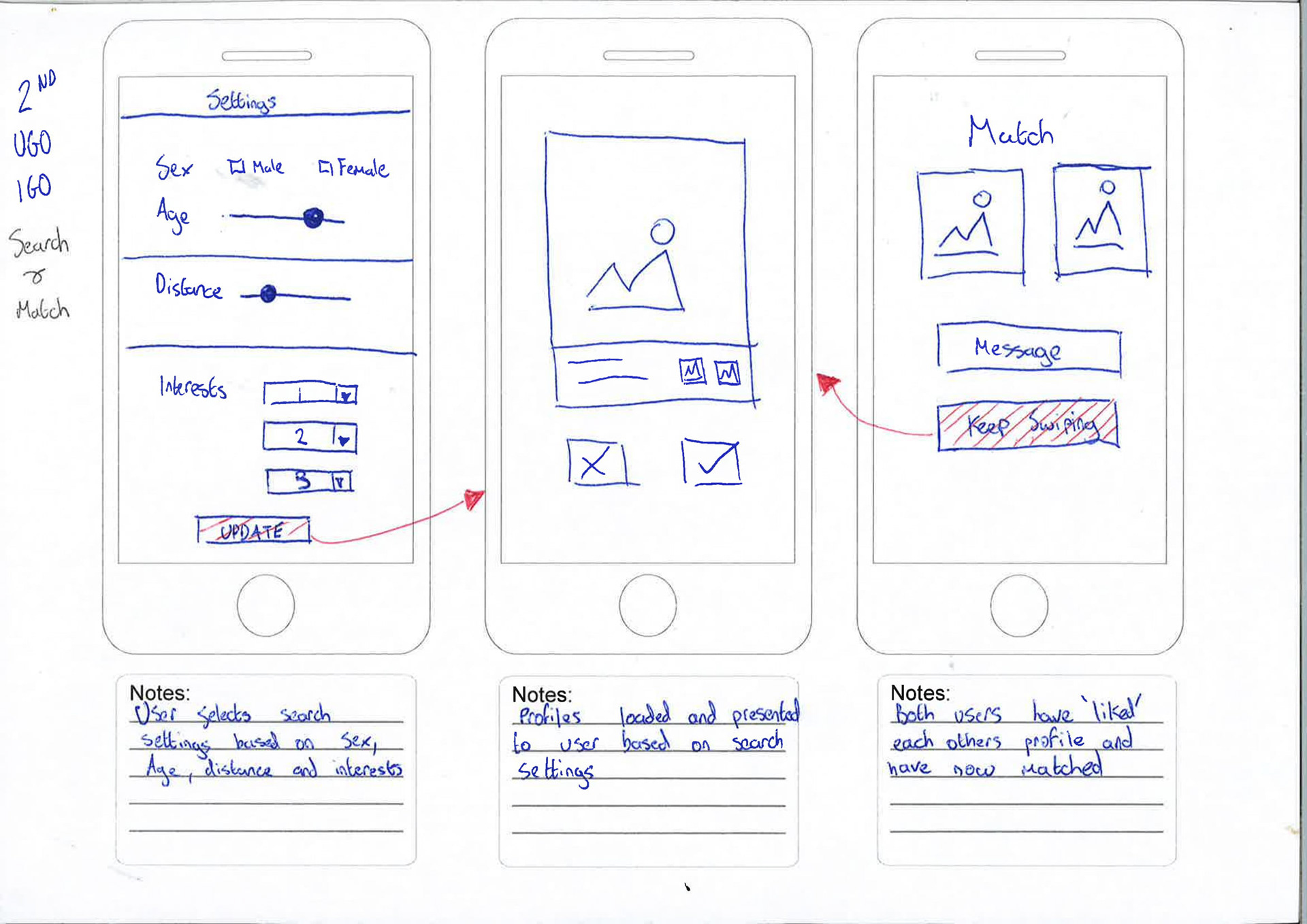
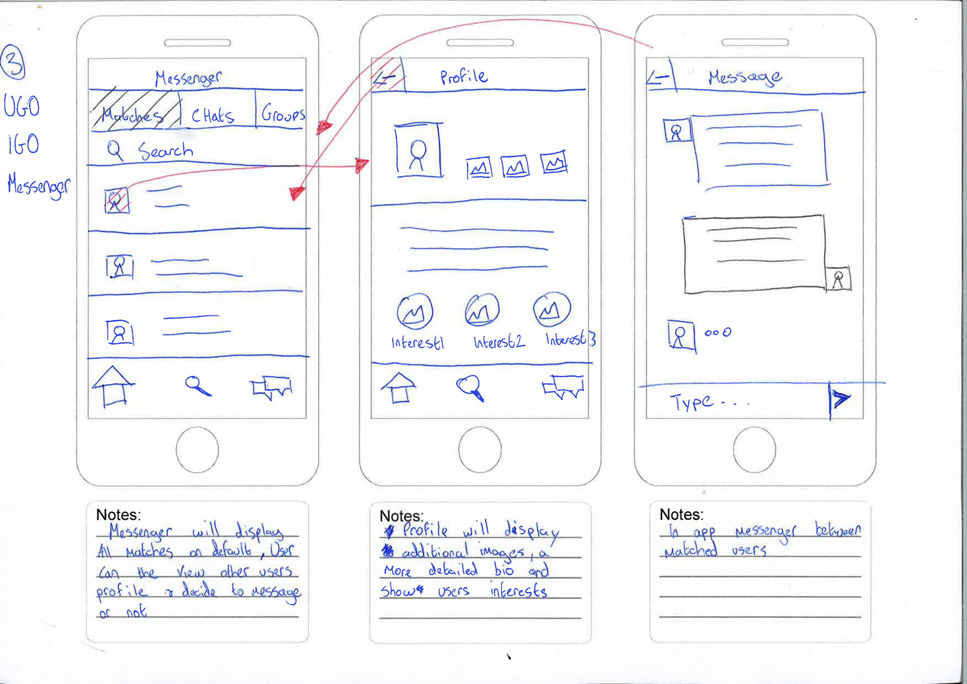
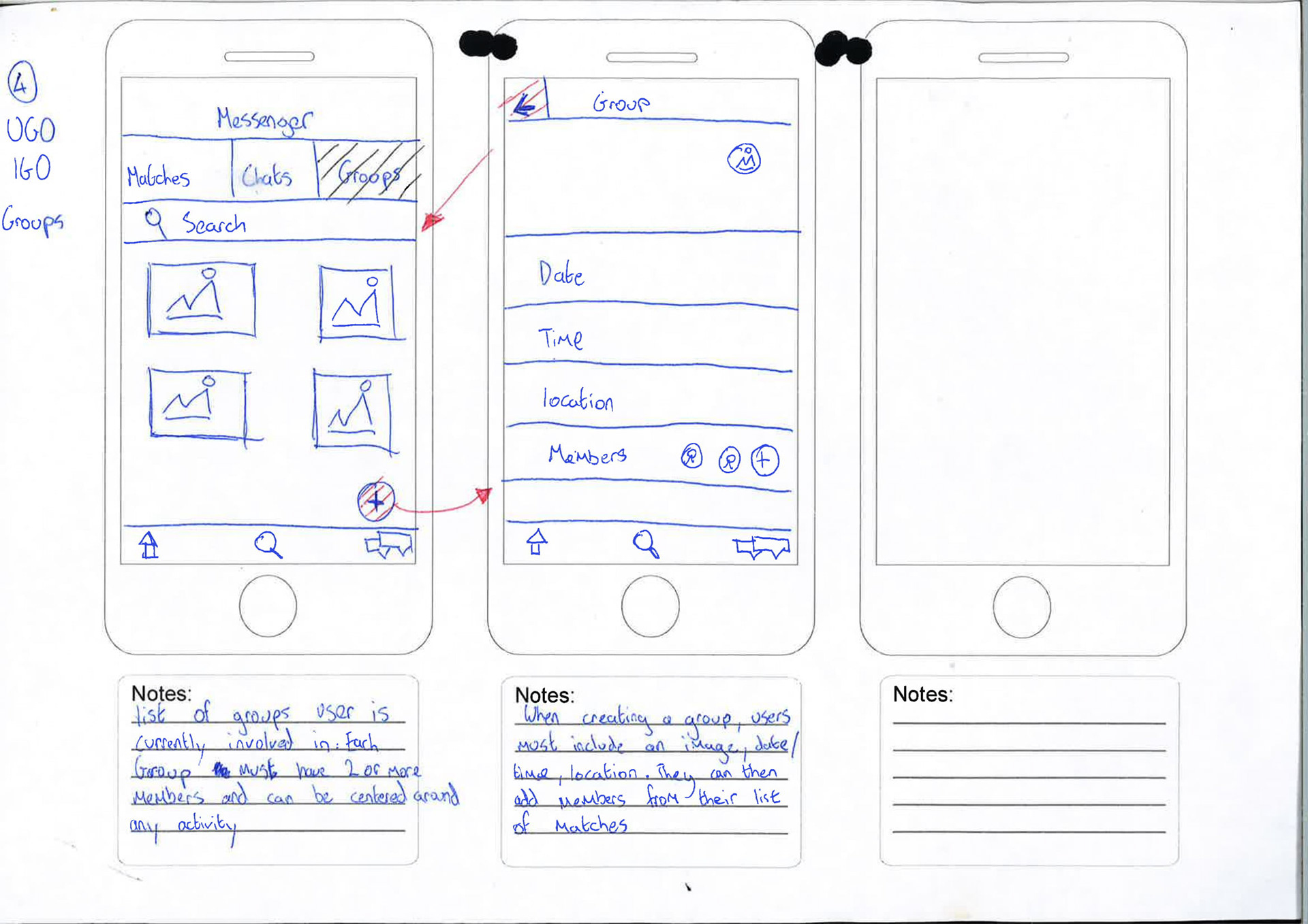
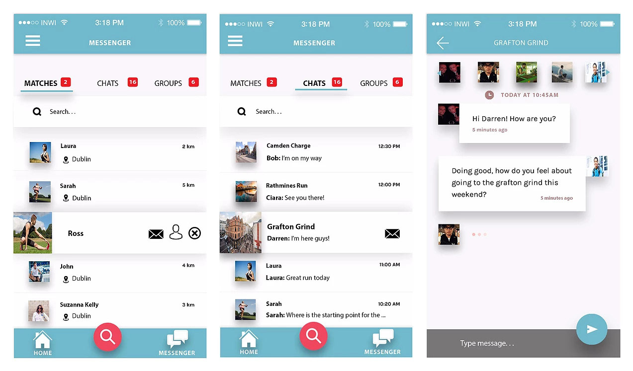
Throughout the sketching process, I focused on the two core features of the application, the messenger and matching system. I experimented with the idea of creating events external to the messenger however feedback from users indicated they preferred that events or groups should be created in the messenger similar to WhatsApp.
FINDINGS:
• Users understood the concept of the application without any assistance.
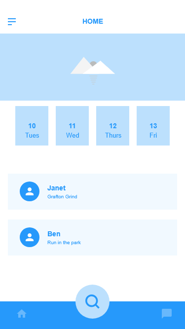
• Users asked for a calendar to be included, so as to keep track of their events.
• Users suggested removing profile images so matches weren't driven by appearance.
DESIGN SOLUTIONS:
• Calendar was added with ability to navigate between week and month.
• For user safety profile images had to be included.
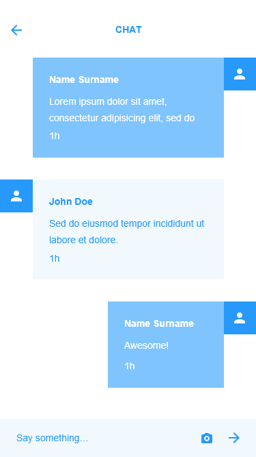
• Events and groups moved to messenger section.

PROTOTYPING
MID-FIDELITY WIREFRAMES:
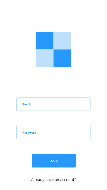
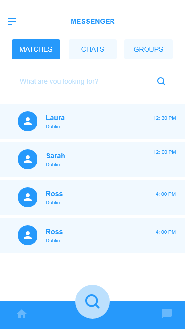
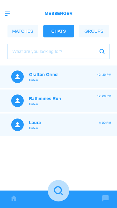
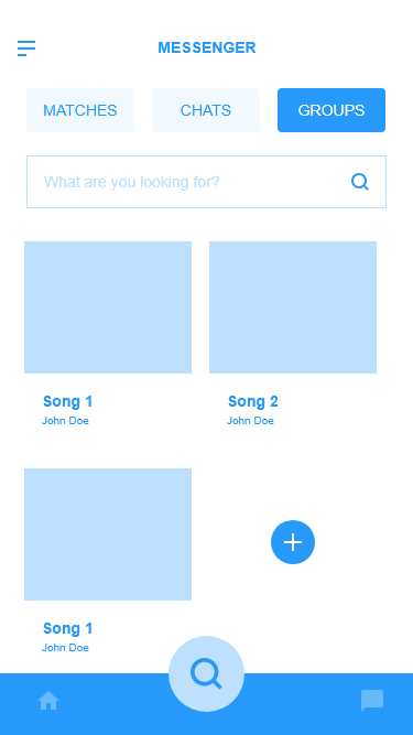
I turned my revised sketches into a blue and white interactive prototype done with XD. I defined UI elements, design patterns and visual hierarchy. This prototype was tested in-person and remotely with members of our target audience and allowed the testers to gain a more realistic insight to the application.
FINDINGS:
• Users first coined the term “tinder sports” to describe our application.
• Users did not use the swipe functionality when viewing different profiles.
• Users identified the personal details page lacked space to give a substantial bio.
• No feedback on matching someone, no overlay to say they have been added.
DESIGN SOLUTIONS:
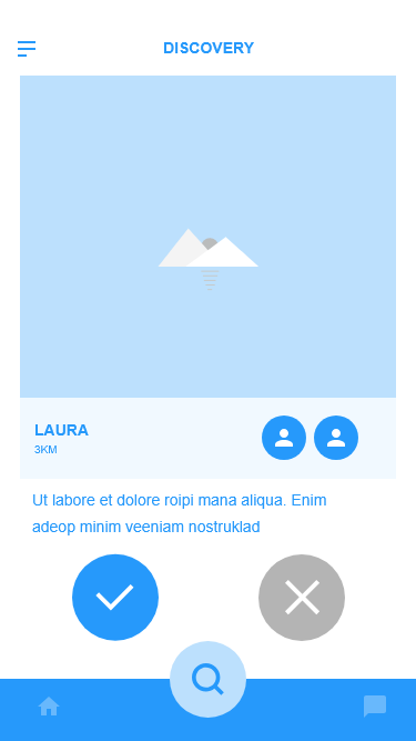
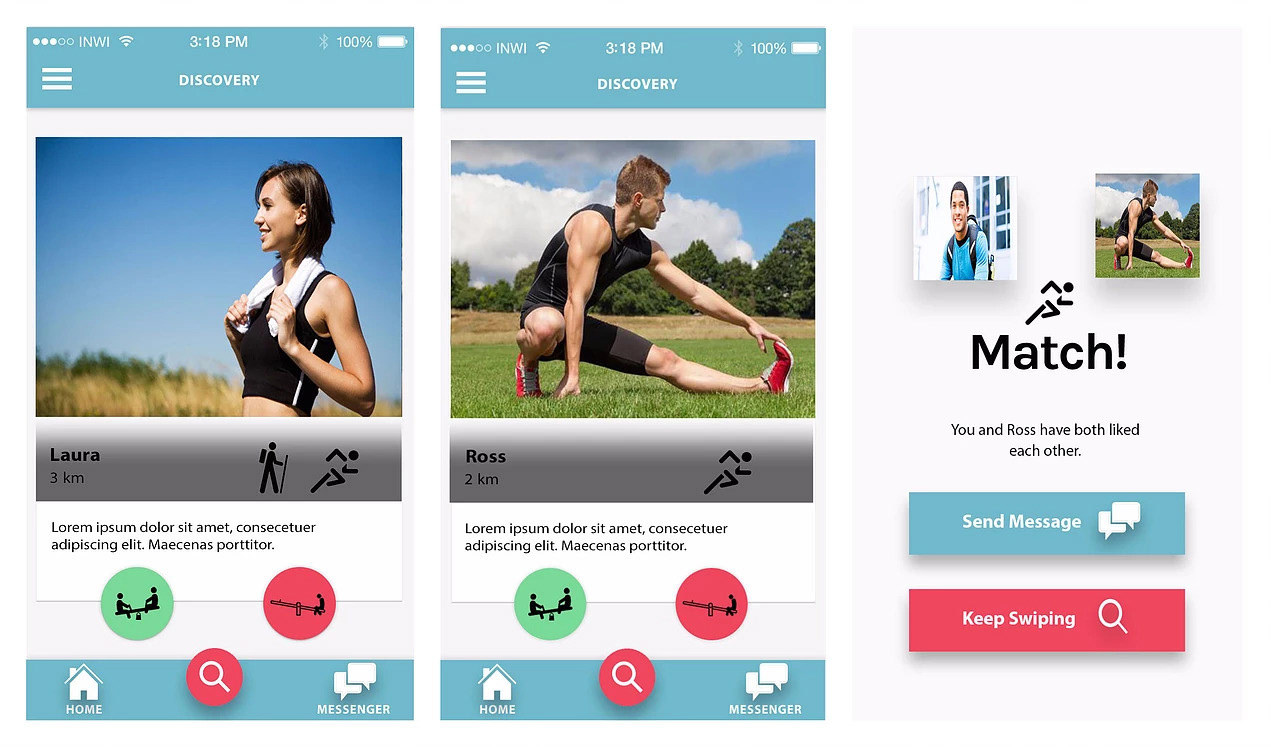
• Remove swipe functionality and focus on "Yes" "No" buttons.
• Increase bio section in personal details page.
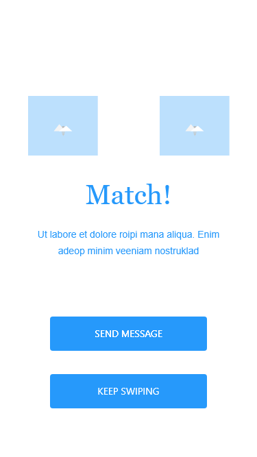
• Match screen introduced and displayed when a match occurs.
FINAL DESIGN
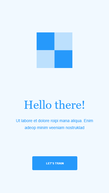
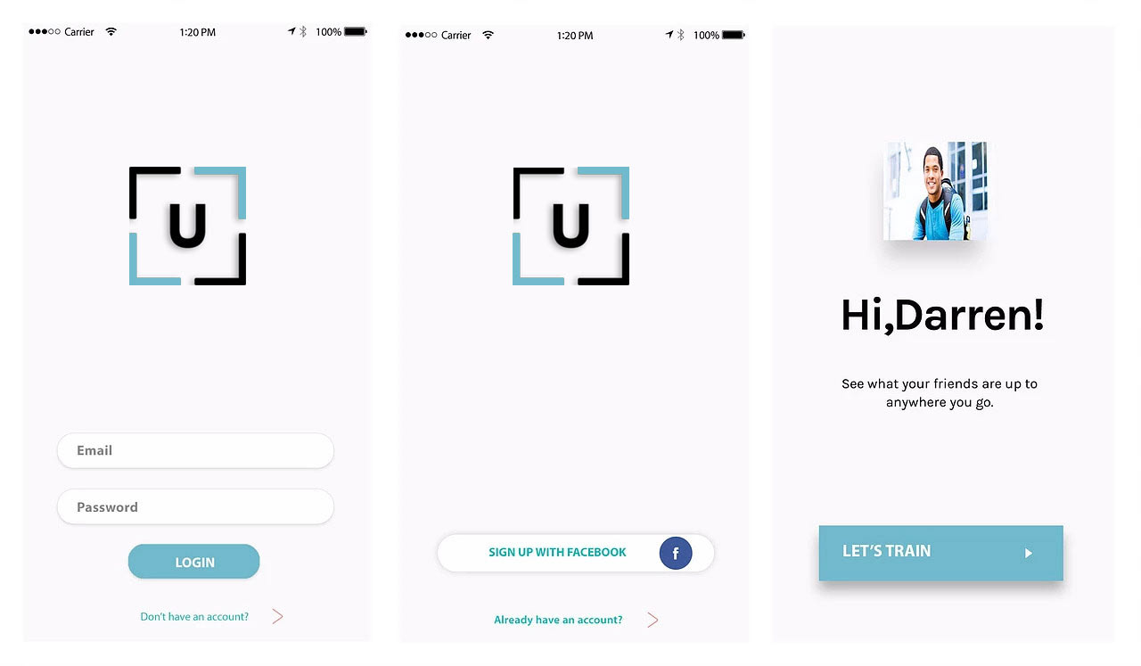
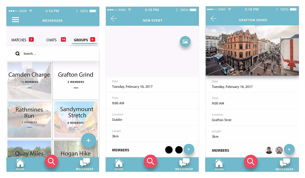
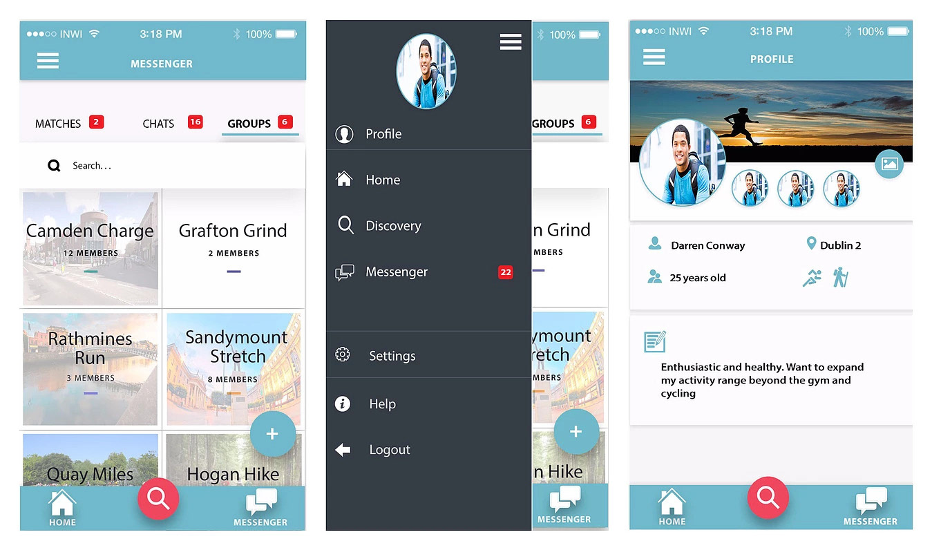
The current design has evolved over multiple builds and iterations, and adheres to current design trends. The design meets the needs of our users and the clean, minimalist UI is in keeping with how the team envisioned what UGO IGO would look like. The layout and colours used helped give the app an identity that when accompanied with the custom icons I developed was something the team was very happy with.
HIGH FIDELITY SCREENS

WHAT I LEARNED
• Research is everything: – Forming a personality for a product is not only fun, but it will engage your users in a whole different way. Journey mapping is a process I found very useful, it helped me separate my own perspective from the real needs of users.
• Don't be afraid to try new tools:– Implementing new tools during a live project can be overwhelming, but you don’t always have the time to try them out beforehand. If you you think that another tool might work better, use it and avoid the infinite loop of “coulda-shoulda-woulda”.
• The lines between UX and product management are blurry: – Don’t be hesitant to push for an experience you believe in.
